Preview image. Unlock full-res
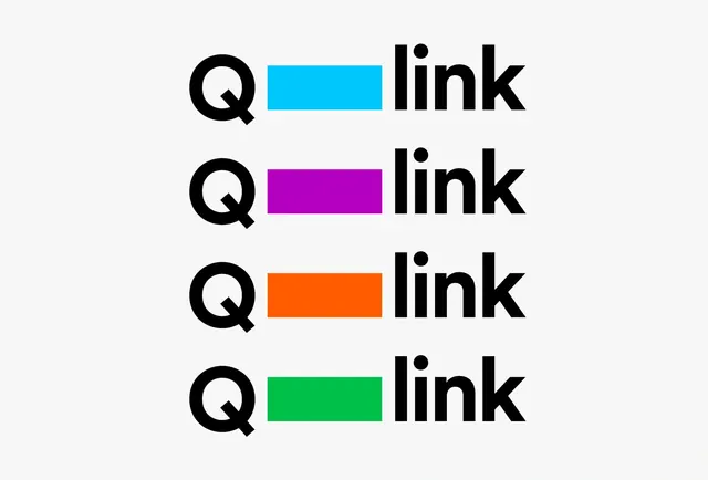
Identity system showing four stacked versions of the Q-link logo with different colored accent bars in cyan, magenta, orange, and green against a white background.
Summary
A modular logo identity system showing how a single Q-link mark and wordmark remain constant while a vibrant accent bar shifts through primary colors: cyan, magenta, orange, and green.
Visual description
Four horizontal arrangements stacked vertically. Each row pairs a bold capital Q mark on the left with a bright horizontal bar (cyan, magenta, orange, green respectively) in the middle, followed by the word "link" in bold sans-serif on the right. All elements sit on a white background. The color bars are the only variable; the Q and type remain identical across all four.
Key takeaway
Elegant system flexibility: the constant mark + type create recognition and stability while the color bar allows instant visual variation for applications, departments, or product lines.
Reuse notes
Useful reference for multi-color brand systems or design system documentation. The clarity of the grid and high contrast make it work at any size. Pairs well with brand guidelines or marketing case studies.
More like this




Keep what you find
A free account saves references to boards and can send you a weekly email of picks based on what you save.
To see every result, go Pro.