Preview image. Unlock full-res
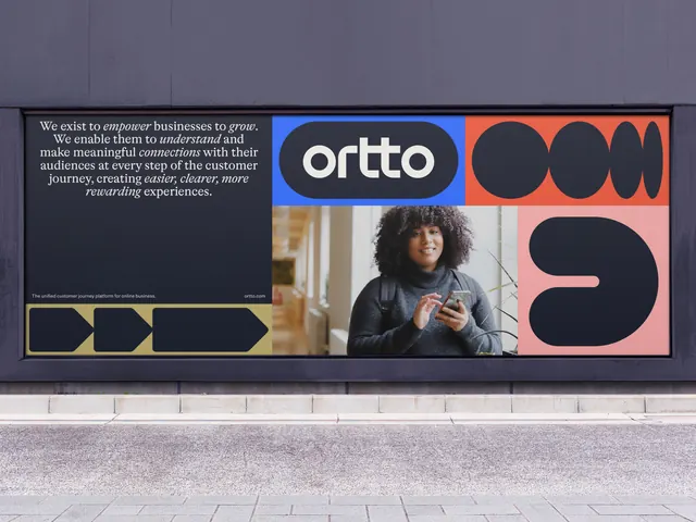
A wide landscape hoarding splitting a serif mission statement, the wordmark in a blue panel, a portrait photo and oversized cropped letterforms.
More like this
See all
Summary
A long horizontal hoarding set into a dark wall at street level, divided into a written mission statement on the left and a color-blocked run of wordmark, photography and oversized letterforms on the right.
Visual description
The panel is recessed in a charcoal wall above a paved footpath. Its left third is near-black and carries a centered mission statement in white serif, with empower, grow, understand, connections, easier, clearer and more rewarding set in italic so the emphasis words zigzag through the paragraph. A one-line descriptor and the URL sit small at the bottom of that block, and below them an olive strip holds three black arrow shapes pointing right. The right two thirds is a grid: a bright blue cell containing the ortto wordmark reversed out in a black pill; a red cell filled with black ovals and lens shapes cropped hard at the edge so they read as letterforms losing their counters; a photograph of a woman in a grey turtleneck holding a phone in a bright interior; and a pink cell holding a single oversized black form that resembles a rotated lowercase letter. Every shape shares the same fat rounded terminals as the wordmark.
Key takeaway
Cropping the brand's own letterforms until they become abstract blocks lets the type system double as pattern, so the board reads as color and shape from across the street and as language up close. Setting the emphasis words in italic serif inside an otherwise geometric identity gives the statement a human voice.
Reuse notes
Strong reference for a brand manifesto placed in public space, or for any wide format that has to hold copy, imagery and pure graphics at once. The serif paragraph needs reading distance, so this only works at street level rather than roadside. Requires a typeface with distinctive enough shapes to survive being cropped.