Preview image. Unlock full-res
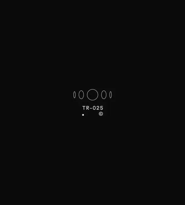
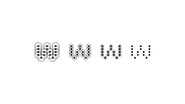
A minimal micrographic brand identity for Tilde Research featuring monospaced type, coded references, and icon marks animated across a stark black canvas.
More like this
See all
Summary
A minimal micrographic brand identity for Tilde Research featuring monospaced type, coded references, and icon marks animated across a stark black canvas.
Visual description
A tall near-black canvas holds a tiny centered lockup surrounded by vast empty space. A row of five thin white outlined ellipses, widest in the middle and narrowing toward both ends, reads like a rotating sphere or moon phases. Below it, a small spaced monospaced-style code label reading TR-025 sits above a tiny solid white square and a copyright symbol.
Key takeaway
Shrink the identity to a hairline-sized cluster in a huge black field so the emptiness becomes the brand statement. A single repeated outline shape in graded widths implies motion without any fill.
Reuse notes
Reach for this as a identity system reference. Pairs with typographic, experimental directions. Original by Sasha Birukoff.
More like this


Keep what you find
A free account saves references to boards and can send you a weekly email of picks based on what you save.
To see every result, go Pro.