Preview image. Unlock full-res
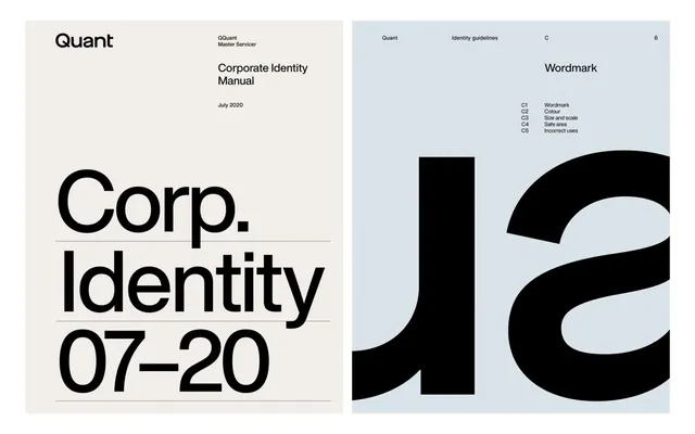
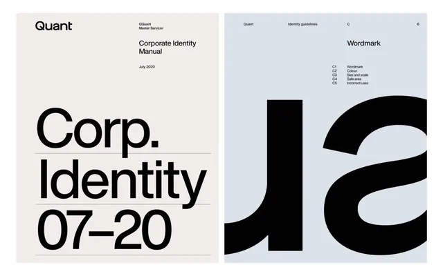
A spread from the Quant corporate identity manual, showing cover/title page and a wordmark specification page with asymmetric layout across cream and pale-blue grounds.
Summary
Two pages from the Quant corporate identity manual (July 2020), showing the wordmark on a cream ground and a specification/guidelines page on pale blue, unified by stark black typography and asymmetric layout.
Visual description
Left page: cream/beige ground with "Quant" as the dominant wordmark in bold sans-serif, underlined, occupying the lower third. Above it sits meta information: "OQuant Master Servicer" and "Corporate Identity Manual" in smaller type, with "July 2020" noted. Right page: pale blue/lavender ground with a section header "Wordmark" and a structured reference list (C1, C2, C3, C4, C5 with corresponding guideline labels). Below that sits a large curved black abstract shape (part of the identity's secondary mark system), rendered in negative space. Typography is consistent, sans-serif, modern, black on light grounds. A thin horizontal rule separates sections on the left page.
Key takeaway
The color-blocking (cream and blue) creates visual rhythm across a two-page spread while keeping the system cohesive; the asymmetric grid (heavy text left, graphical/specification right) balances information density with breathing room. The abstract curved mark adds dynamism to an otherwise minimal, institutional layout.
Reuse notes
This approach works for b2b or corporate identities where a manual must convey authority and structure. The split-color background is especially useful when part of a longer guideline (the color becomes a running visual theme). Avoid if the brand's secondary mark is too literal or organic; here, the bold geometric curve reads as modern and confident alongside the sans-serif.
More like this




Keep what you find
A free account saves references to boards and can send you a weekly email of picks based on what you save.
To see every result, go Pro.