Preview image. Unlock full-res
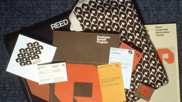
Vintage corporate identity system featuring geometric pattern, stationery suite, and branded documents in warm orange, brown, and cream tones.
Summary
A vintage corporate identity system for Reed, featuring a geometric repeating pattern, stationery suite, and branded documents in warm, earthy tones.
Visual description
Flat lay composition of multiple branded items including business cards, folders, documents, and patterned material samples arranged against a dark blue textile background. The identity system uses a repeating geometric pattern (interlocking squares or diamonds) in brown/gold on white, cream, and patterned backgrounds. The primary color palette is warm and earthy: burnt orange, brown, cream, and gold. Various documents show "Reed" branding, "Employee Benefit Program," and "Corporate Information Centre" text. Multiple pieces demonstrate consistent application of the mark and geometric pattern across different formats and sizes. The overall feel is organized, professional, and distinctly 1960s–70s in aesthetic.
Key takeaway
How a single repeating geometric pattern can unify an entire corporate system across diverse applications. Restraint in color palette and consistent pattern usage creates sophistication and recognizability.
Reuse notes
Excellent historical reference for corporate design systems and mid-century branding approaches. The geometric pattern could be adapted for modern applications. The warm color palette is timeless and would work well for heritage brands or nostalgia-focused identities. The stationery system demonstrates how to handle pattern at different scales.
More like this


Keep what you find
A free account saves references to boards and can send you a weekly email of picks based on what you save.
To see every result, go Pro.