
Preview image. Unlock full-res
A quick brand identity concept for Cyberguard Labs featuring geometric logo marks, construction grids, colorful icon variants, and business card mockups in a clean Swiss-influenced style.
More like this
See all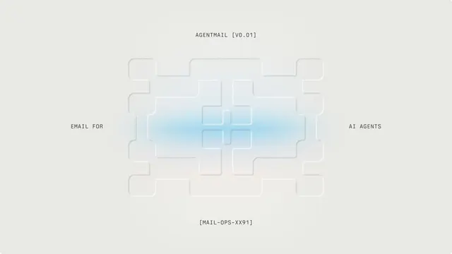


Summary
A quick brand identity concept for Cyberguard Labs featuring geometric logo marks, construction grids, colorful icon variants, and business card mockups in a clean Swiss-influenced style.
Visual description
A near-white 16:9 frame is divided by thin lavender-grey lines that bulge into concave, star-like intersections, carving the canvas into large rounded-corner panels. A two-line title in a muted grey-violet grotesque sits left of center in the lower-right panel, with a small uppercase monospace tagline and two tiny line icons (a globe and a CE-style mark) at the bottom left. A soft gradient smudge and fine grain add a subtle metallic sheen along the dividers.
Key takeaway
Let the grid lines themselves become the brand motif by flaring them into concave star joints, so the layout structure doubles as a logo shape. Pair it with a single low-contrast type color for a calm, premium feel.
Reuse notes
Reach for this as a identity system reference. Pairs with geometric, minimal directions. Original by kushal.
More like this

Keep what you find
A free account saves references to boards and can send you a weekly email of picks based on what you save.
To see every result, go Pro.