Preview image. Unlock full-res
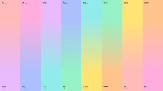
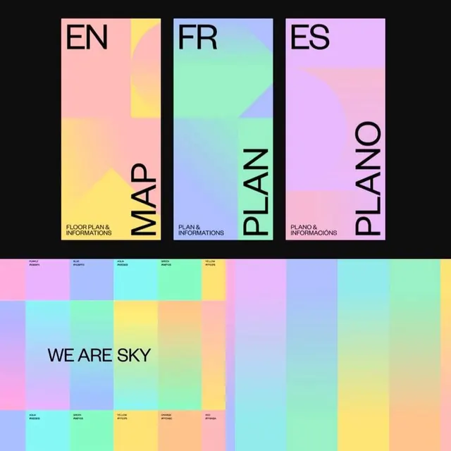
Palette specimen of eight full-height columns, each blending one pastel hue into the next and labelled top and bottom with colour name and hex.
More like this
See all

Summary
A colour palette page that shows the hues as gradients between neighbours rather than as flat chips, so every legal blend is visible at once.
Visual description
Eight equal vertical columns fill the frame edge to edge with no gutters. Each column is a smooth vertical gradient running from one pastel at the top to a different pastel at the bottom, and the sequence is offset by one so each colour reappears as the start of the next column, forming a continuous chain across the sheet. Small black all-caps sans labels sit in the top left of each column and again in the bottom left, each giving a colour name over its hex value: RED #FFBABA, PINK #FFADDE, PURPLE #E8B9FA, BLUE #ADBFFD, AQUA #92EBEB, GREEN #95F1C5, YELLOW #FFE375, ORANGE #FFC48C. The type is small and quiet against the large soft fields. Faint horizontal banding is visible in the gradients. No other elements appear.
Key takeaway
Documenting a palette as adjacent gradients teaches the transitions, not just the values, which is what a system that actually uses gradients needs. Repeating each hex at both ends makes any column readable as a self-contained pair.
Reuse notes
Good template for the colour page of a brand guideline where gradients are part of the system rather than decoration. Works best with a palette of similar value and saturation, as here; mixing in a dark or highly saturated colour would break the even wash. The small label type has borderline contrast on the lightest columns and would need checking against accessibility targets in a real document.
More like this




Keep what you find
A free account saves references to boards and can send you a weekly email of picks based on what you save.
To see every result, go Pro.