Preview image. Unlock full-res
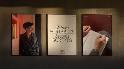
Three framed campaign posters, two moody photographs flanking a cream typographic panel reading "Where scribbles become scripts".
More like this
See all

Summary
A campaign shown as three evenly spaced framed posters on a dark warm wall, with the typographic panel held in the centre between two photographic ones.
Visual description
The wall is a deep warm brown lit from above, so a soft pool of light falls across the upper half and the corners drop into near black. Three thin black frames of the same portrait proportion hang in a row at equal spacing. The left frame holds a photograph of a person in a dark blazer standing in a red-lit interior, seen in profile and cropped tight. The centre frame is cream and typographic: a small line of caption type at the top, then "Where" in serif italic, SCRIBBLES in serif caps, "become" in italic and SCRIPTS in caps, the words stepping down the panel in alternating weights, with the Papier mark and wordmark centred small beneath. The right frame is a close photograph of hands writing in an open notebook with an orange pen, against a deep oxblood background. The two photographs share the same dark red key, which ties them to the cream panel between them.
Key takeaway
Framing the typographic panel in the middle of two photographic ones gives a campaign a fixed centre of gravity and makes the line legible at a distance. The shared red cast across both photographs is what makes three separate images read as one set.
Reuse notes
Useful for retail, gallery and in-store display mockups, and for presenting a campaign as a system rather than a single asset. The lighting is very low key, so the typographic panel needs to stay pale to hold its place; a dark centre panel would break the rhythm entirely.