Preview image. Unlock full-res
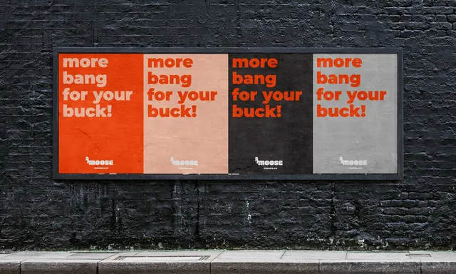
The same Moose headline poster repeated four times across one billboard frame, each panel a different two-colour pairing from the brand palette.
More like this
See all
Summary
Four portrait posters carrying identical copy sit side by side in a single landscape frame, so the only variable across the run is colour. The repetition turns a palette into a poster campaign.
Visual description
A black-painted brick wall holds a wide black-framed poster site containing four equal portrait panels. Each reads "more bang for your buck!" over three lines in a heavy rounded sans, set flush left and top, with the small Moose logotype and "moose.co" centred at the foot of every panel. Panel one is orange with pale pink type, panel two is pale pink with orange type, panel three is near black with orange type, panel four is warm grey with orange type. Line breaks, type size and logo position are identical in all four, so the eye reads a rhythm of colour swaps rather than four separate messages. Paper grain, paste creases and a damp streak on the brickwork below are visible, and the pavement and kerb run across the bottom of the shot.
Key takeaway
Holding layout, copy and typesetting completely fixed and moving only the two colours is the cheapest way to make a palette feel like a system in public. The inverted pair, orange on pink and pink on orange, is what proves the palette is reversible rather than just decorative.
Reuse notes
Reach for this when presenting a colour system to a client or when a campaign needs to occupy a wide site without four separate concepts. Depends on very short copy and a logo small enough to survive at panel width. The near-black panel is the only one that reads at distance, so mixing values this widely is a trade of legibility for variety.