Preview image. Unlock full-res
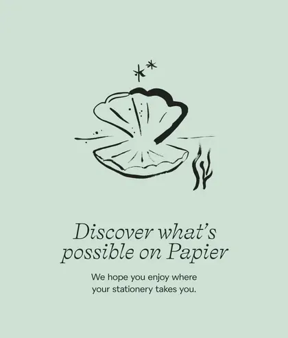
A loose black line drawing of an open shell with a pearl above a centred italic serif sign-off, on a pale mint panel.
More like this
See all
Summary
A vertical pale mint panel holding one loose ink drawing of an open shell above a two-line italic serif message and a small sans-serif sub-line.
Visual description
The ground is a flat soft mint green with no texture or gradient. Centred in the upper half is a hand-drawn illustration in a single dark green line weight: an open bivalve shell seen face on, its upper half a solid inked cap and its lower half drawn as radiating ribs, with a small round pearl in the middle and short dashes suggesting shine. A four-point sparkle and a smaller star float just above it, and two loose wave strokes sit to the lower right, with a short horizontal line to the left as a waterline. Below, "Discover what's possible on Papier" is set across two centred lines in a flowing serif italic, the line break falling after "what's". Beneath that, two lines of small sans-serif copy read "We hope you enjoy where your stationery takes you." Margins are generous and everything sits on one vertical centre axis.
Key takeaway
A single hand-drawn spot illustration plus a warm sign-off is enough to carry a whole panel when the ground stays flat and the layout stays centred. Pairing an expressive serif italic with plain sans sub-copy keeps the sentiment from tipping into greeting-card territory.
Reuse notes
Reach for this for packaging inserts, thank-you screens, order confirmations or the closing panel of a deck. The drawing carries a lot of personality, so it needs an illustration style already established elsewhere in the identity; a generic stock line drawing in the same slot would read as filler.
More like this


Keep what you find
A free account saves references to boards and can send you a weekly email of picks based on what you save.
To see every result, go Pro.