Preview image. Unlock full-res
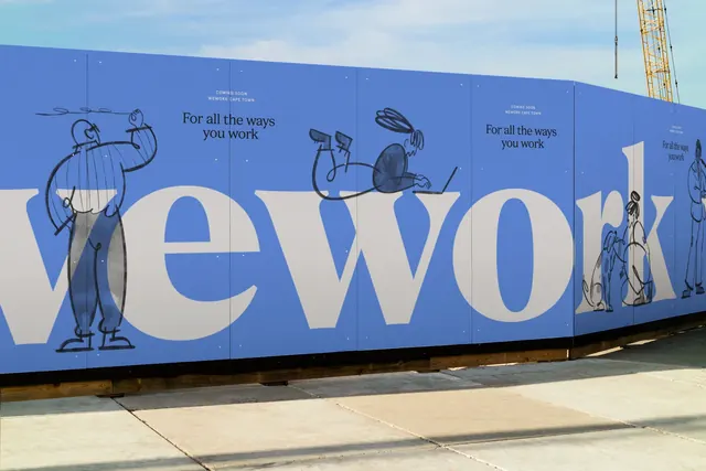
A long blue site hoarding carrying the oversized WeWork wordmark in a serif face with loose ink figures drawn around and across the letters.
More like this
See all

Summary
A construction hoarding photographed in raking daylight, applying the brand as a single enormous serif wordmark with sketchy ink characters interacting with the letterforms.
Visual description
The hoarding runs from the left edge deep into the frame, angling away to a vanishing point at the right where a yellow crane arm and a hook are visible against a pale blue sky. Broad concrete paving fills the foreground. The panels are a soft cornflower blue with visible seams and small fixing dots. Set across them at very large scale is the lowercase word "wework" in a high-contrast serif with fine hairlines and sharp bracketed serifs, coloured a warm off-white; the leading "w" is cut off by the left edge. Drawn over and around the letters in loose black ink, with grey wash fills, are several figures: a person at left holding a long pole across their shoulders, a figure sitting cross-legged on top of the "w" working at a laptop, a person crouching beside a dog near the "r", and a walking figure at the far right. Above the wordmark, repeated on each hoarding section, sit two lines of small serif copy reading "For all the ways you work" alongside a tiny all-caps line "COMING SOON / WEWORK CAPE TOWN".
Key takeaway
Pairing a refined high-contrast serif with deliberately scruffy ink figures creates warmth without abandoning the typographic discipline. Repeating the tagline and location line at each panel means the message survives no matter where a passer-by joins the wall.
Reuse notes
A strong model for pre-opening hoardings, event walls and long corridor graphics where the viewer only ever sees a fragment. The figures scale the wall for the eye and give the flat colour something to read against. It needs illustration with genuine looseness; a tidy vector character set would fight the serif rather than soften it.
More like this





Keep what you find
A free account saves references to boards and can send you a weekly email of picks based on what you save.
To see every result, go Pro.