Preview image. Unlock full-res
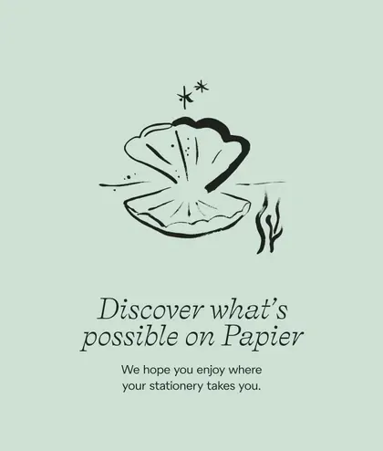
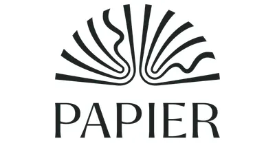
The Papier stacked lockup, a fanned open-book mark of radiating lines above a wide-spaced serif wordmark, in charcoal on white.
More like this
See all
Summary
The primary stacked lockup: a hand-drawn fanned book mark sitting directly above a letterspaced serif wordmark, both in one charcoal weight on plain white.
Visual description
The mark reads as an open book seen from above, or a shell. Roughly a dozen tapered strokes radiate outward and upward from a low centre point, longest in the middle and shortening toward the outer edges, each drawn with a slightly uneven ink-like weight rather than as a geometric fan. At the centre two pages curl up into loose looping strokes, one on each side, giving the symmetry a deliberate wobble. Directly below, PAPIER is set in a high-contrast serif with generous letterspacing, its cap height a little under a third of the mark's height and its overall width matching the mark's span, so the two elements form a compact centred block. There is no strapline, rule, or second colour, and the surrounding white is even.
Key takeaway
The mark is fully symmetrical in structure but hand-drawn in execution, so it keeps warmth without losing the balance a stacked lockup needs. Matching the wordmark's tracked-out width to the mark's span is what locks the two into a single silhouette.
Reuse notes
A clean reference for stacked lockups where an emblem has to sit over a short wordmark. The looping page details are fine at this size but are the first thing to break at favicon scale, so a simplified mark would be needed for small applications.