Preview image. Unlock full-res
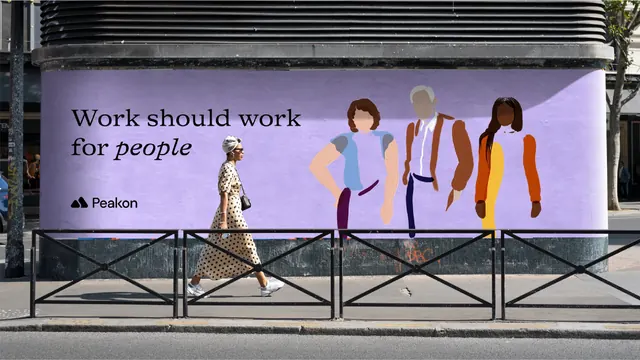
A lilac wheatpasted hoarding wrapping a curved kiosk, pairing a serif headline and the Peakon logo with three flat faceless figures.
More like this
See all


Summary
The identity shown as a large lilac poster pasted around a curved street kiosk, with the headline and logo held left and three illustrated figures filling the right.
Visual description
A wide daylight street photograph. The poster wraps a curved concrete kiosk under a black louvred canopy, its lilac ground reading flat against the grey city around it. On the left, "Work should work for people" is set large in black across two lines in a high-contrast serif, with "people" alone in italic. Below it sits the logo: two overlapping rounded black triangles, the smaller one forward left, followed by "Peakon" in a black geometric sans. The right two thirds carry three standing figures painted in a flat brushy illustration style with no facial features, one in a pale blue top and maroon trousers with a hand on the hip, one in a white shirt and rust jacket with navy trousers, one in a yellow dress with an orange sleeve and long dark hair. Skin tones and clothing differ across the three. In front of the hoarding a woman in a cream polka-dot dress and headwrap walks past behind black railings, giving the wall its scale, with pavement, kerb and road filling the lower quarter.
Key takeaway
Reserving the left third for a serif headline and logo and letting flat illustrated figures own the rest keeps a very wide format readable from a moving pavement. Italicising the single word "people" carries the whole emphasis without a second colour or weight.
Reuse notes
Strong reference for HR, workplace and people-focused software brands that need a warm out-of-home presence. The faceless flat figures are the mechanism that keeps the illustration inclusive without casting; they only work at this scale, and the lilac ground needs the black type to stay legible in bright daylight.