Preview image. Unlock full-res
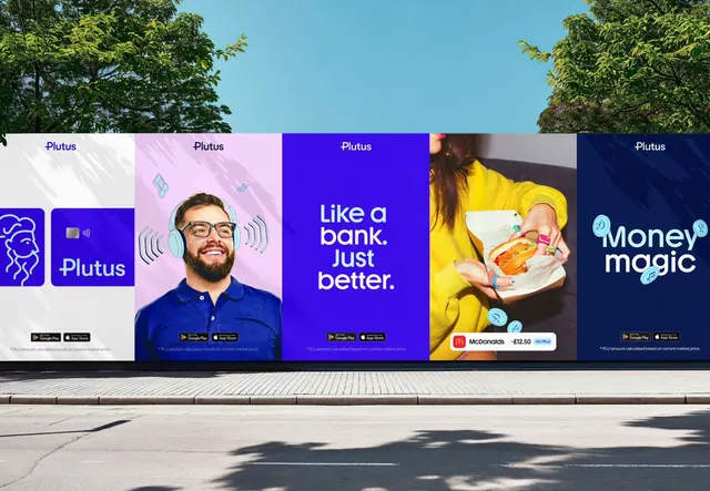
A street hoarding running five Plutus poster panels in sequence, alternating logo, portrait, type-only and product-moment executions.
More like this
See all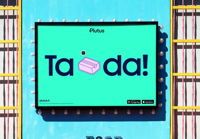
Summary
An out-of-home application showing five Plutus posters side by side on a street hoarding, each a different execution of the same system, read as one sequence.
Visual description
The hoarding runs the full width of the frame at street level, shot in bright daylight with trees and blue sky above and a pavement and road below; leaf shadows fall across the panels. Every panel carries the Plutus wordmark small and centered at the top and a line of legal small print at the bottom, and most carry Google Play and App Store badges. Panel one is off-white and holds a line-art lion head in a blue rounded square beside a violet card panel with the wordmark. Panel two is pale pink with a cut-out photograph of a bearded man in a blue polo and headphones, ringed by line-art sound waves and music notes. Panel three is solid violet with a three-line headline in white and pale blue geometric sans, ranged left and set tight. Panel four is a photograph of a woman in a yellow jacket holding a burger, with pale blue coin doodles floating around her hands and a white transaction pill showing a merchant, an amount and a small rewards chip. Panel five is deep navy with a two-line pale blue headline and more coin doodles. The palette stays inside violet, navy, pale blue, pale pink and off-white throughout.
Key takeaway
The system is proved by variety rather than repetition: a logo panel, a portrait, a type-only statement and two product moments all sit together without a template. The consistent top wordmark, bottom badge row and legal line act as the frame that holds five very different interiors. Line-art doodles and the transaction pill migrate from the product interface onto photography, so the app and the poster share one vocabulary.
Reuse notes
Strong reference for planning an out-of-home campaign as a sequence read in motion rather than as isolated posters, and for fintech brands wanting warmth without losing clarity. It requires a real photographic library and a doodle set to work; with only type panels the rhythm collapses. Third-party merchant marks appear in the artwork, so treat those as placeholders.