Preview image. Unlock full-res
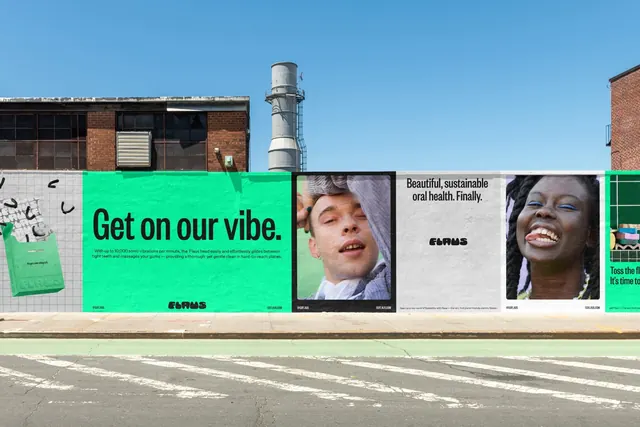
A run of Flaus posters wheatpasted along a street hoarding, alternating a flat green type panel with close-cropped portrait posters.
More like this
See all
Summary
A street-level poster campaign pasted across a construction hoarding, pairing one oversized green typographic panel with tightly cropped portrait posters in a repeating rhythm.
Visual description
A daylight photograph of a brick industrial block with a metal stack behind it. Along the hoarding runs a sequence of pasted posters. The widest panel is a flat bright green field carrying the line "Get on our vibe." in a heavy black sans-serif, two short lines of small body copy beneath it, a social handle bottom left, a URL bottom right, and the soft, rounded black logotype centred at the bottom. To its right, a dark-framed poster holds a close-cropped portrait of a person against a green wall. Next, a light grid-paper poster carries the line "Beautiful, sustainable oral health. Finally." set flush left in black, with the rounded logotype sitting alone in the middle of the sheet. Another portrait poster follows, a laughing face with blue eyeliner, then a partially visible green panel at the right edge. At the far left, a green product carton and small black squiggle marks sit on a grid-paper panel. Every poster shares the same footer band of handle and URL at a tiny size.
Key takeaway
The campaign alternates loud flat colour with quiet grid-paper and lets photo posters break the rhythm, so a long hoarding reads as one system rather than a repeated ad. The rounded logotype is treated as a graphic full stop, dropped in at the bottom of a sheet with nothing competing near it.
Reuse notes
A good reference for out-of-home campaigns that need to hold together across many adjacent panels: fix a footer band, fix two background treatments, and vary only the content. The bright green does the heavy lifting here, so the approach needs a single saturated brand colour to work. Pairs well with close-cropped candid portraiture rather than polished studio shots.