Preview image. Unlock full-res
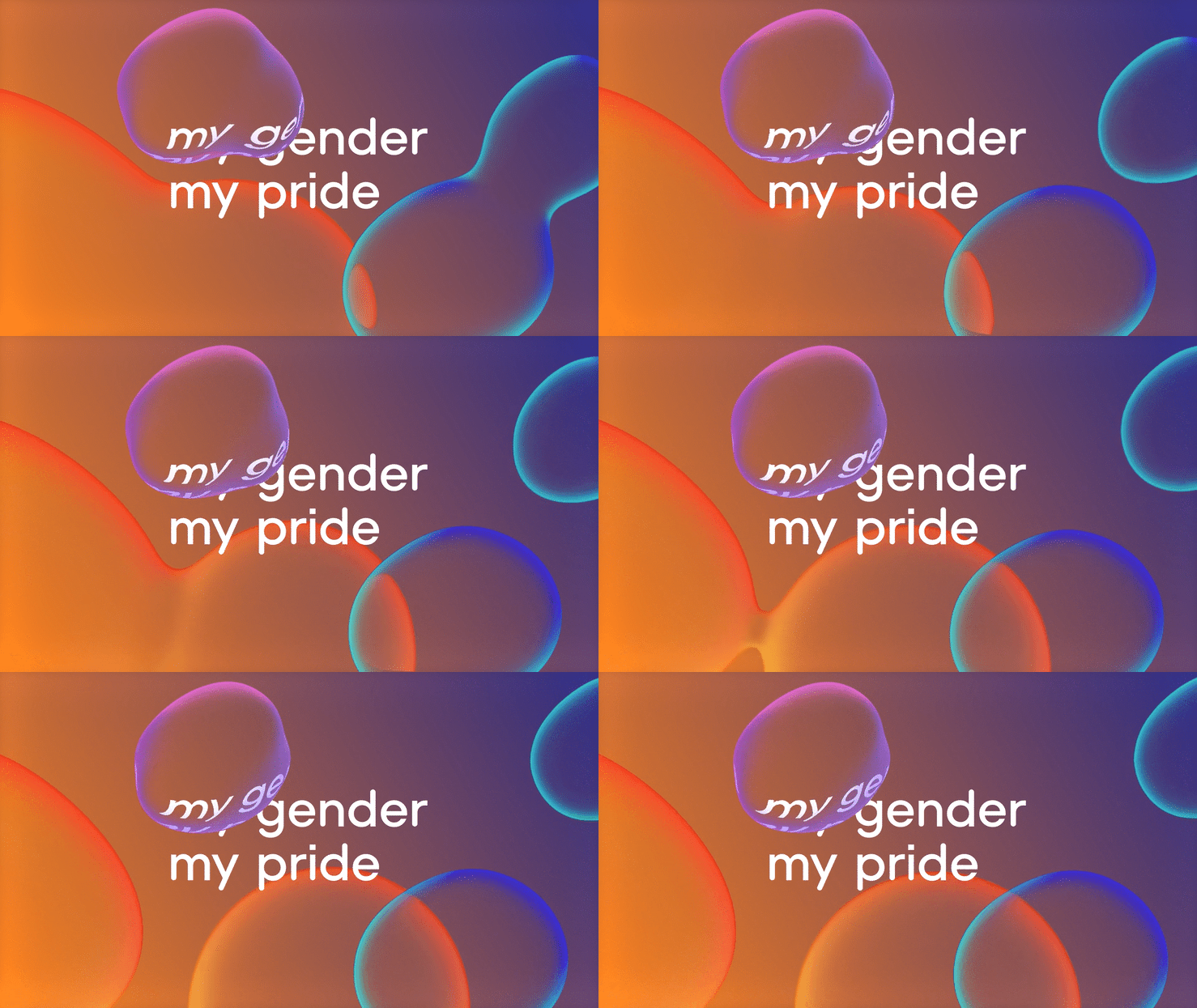
Looping gradient animation where iridescent soap bubbles drift across an orange to purple field and refract the white line "my gender my pride".
More like this
See all
Summary
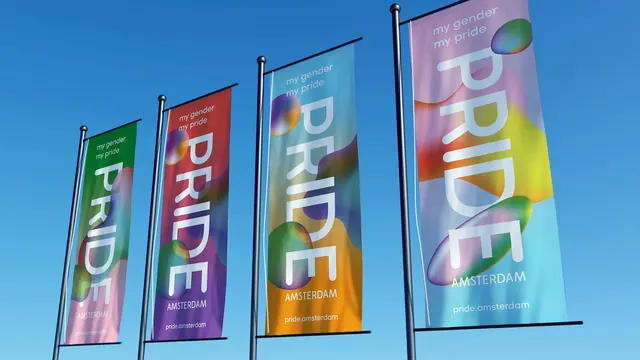
A slow moving field of iridescent bubble forms over a hot orange to violet gradient, with the campaign line set in white sans and deliberately warped where a bubble passes in front of it.
Visual description
The frame is filled edge to edge with a soft gradient that has no hard shapes in it, only bleeds of tangerine, coral red, magenta and deep violet that shift across the loop. Early frames are dominated by orange in the upper left with cool blue and purple pooling at the right; by the end of the loop the purple has spread across most of the field and the orange has retreated to a diagonal band through the lower left. Two or three large rounded blobs behave like soap bubbles: they carry thin bright rims in violet and cyan, hold their own internal colour, and slowly change size, position and outline, sometimes touching and pinching into a figure eight. The copy sits at the left in white lowercase sans-serif on two lines, "my gender" over "my pride", set fairly tight. Where the largest bubble crosses the first line, the letters inside it are bent into a slanted, stretched italic and a faint reversed echo appears below, so the bubble reads as a lens rather than an overlay. Outside the bubble the same letters stay perfectly upright and crisp. Nothing else appears in the frame, no logo, no supporting copy, no framing device.
Key takeaway
Passing the type through the bubble instead of behind or in front of it turns a flat gradient loop into something physical, and it does the conceptual work of the line at the same time. Letting the whole colour field migrate from warm to cool across the loop means the background is never static without ever calling attention to itself.
Reuse notes
Made for a festival or campaign identity that needs endless social variants from one system: change the line, keep the field. Legibility is the caveat, since the refraction deliberately destroys part of the word, so it only works on a short line the audience can complete, and it would fail on a phone number, a date or anything that must be read exactly. Pairs with plain typographic frames that deliver the practical information this one omits.
More like this





Keep what you find
A free account saves references to boards and can send you a weekly email of picks based on what you save.
To see every result, go Pro.