Preview image. Unlock full-res
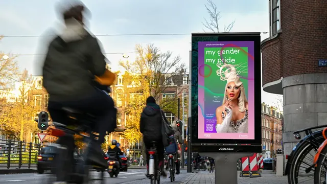
An autumn Amsterdam street scene with a lit display panel running a green-to-pink gradient poster of a drag performer, headline, dates, pronouns and QR code.
More like this
See all
Summary
A second colorway of the same portrait poster template, photographed on a busy autumn street where cyclists blur past the illuminated panel.
Visual description
Wide photograph of an Amsterdam intersection in late autumn: yellow-leaved trees, canal-house facades, a round brick corner building on the right, traffic lights and several cyclists, the nearest so close to the lens that they are heavily motion-blurred. Center right stands a freestanding illuminated display panel marked JCDecaux. Its poster is built on a vertical gradient running from deep green at the top through magenta to pale pink at the foot, with a translucent ribbon of color curving across the upper third and a small iridescent circle floating at the left edge. pride.amsterdam sits in small white type at the top, then my gender / my pride in large white rounded lowercase across two lines. Below it, a cut-out photograph of a drag performer with a tall sculpted platinum hairpiece, dramatic makeup, long nails and a crystal-embellished white gown, posed with one hand raised to the chin. To the left sit the dates 30 july and 7 august split by a short diagonal rule, and beneath them a small block giving the performer's stage name and pronouns, a line inviting viewers to watch the story, and a square QR code. The Pride Amsterdam mark is bottom left, a municipal partner lockup bottom right.
Key takeaway
Running the same template in a completely different gradient shows how far the system can travel while staying recognizable: the layout, type sizes and corner furniture never move, only the color and the subject. Placing the performer's pronouns in the same slot as a caption normalizes them as standard poster information rather than an add-on.
Reuse notes
Useful as an in-situ proof shot for any campaign selling a template plus variable portrait. The blurred foreground cyclists sell scale and real-world placement better than a clean mockup would, which is worth copying when presenting out-of-home work. The dark green top band means light type must stay in the upper third; on a lighter colorway that hierarchy would need rechecking.
More like this
Keep what you find
A free account saves references to boards and can send you a weekly email of picks based on what you save.
To see every result, go Pro.