Preview image. Unlock full-res
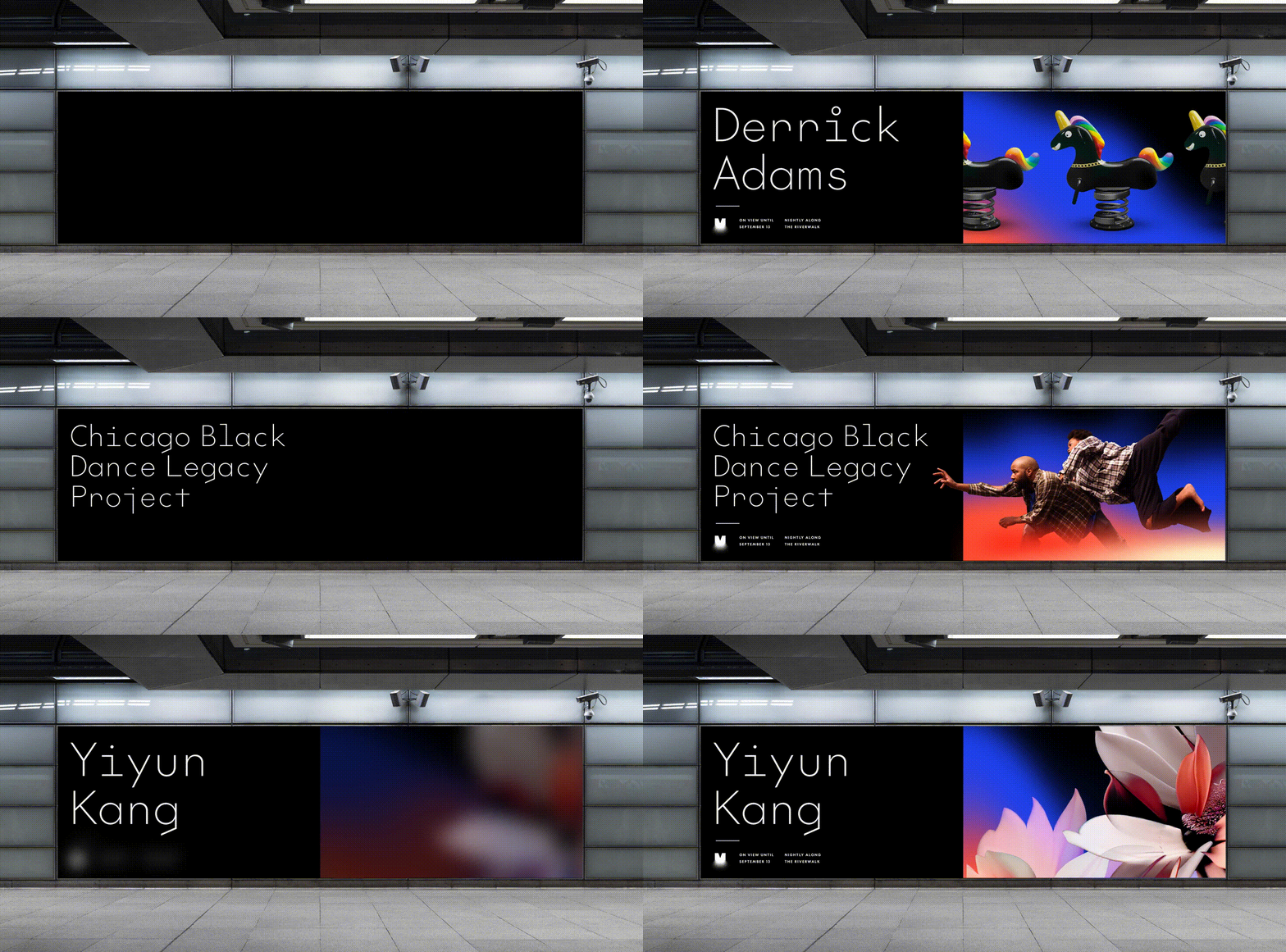
Animated digital screen in a transit station cycling artist names typed in mono type beside artwork panels that wipe in from the right.
More like this
See all
Summary
A wide black transit screen shown in situ, running a loop that types an artist name onto the left half and then wipes a full-color artwork panel into the right half before resetting to black for the next name.
Visual description
The photograph is a concrete station platform with an exposed ceiling, light strips and small cameras above a landscape-format screen mounted flush to the wall. The screen content is pure black. Each cycle starts empty, then a name appears line by line at the left in a light monospaced face with wide letterspacing and generous leading, set in mixed case at large size. A small square logo mark and two columns of very small caption type sit at the bottom left corner. Once the name has landed, a photographic panel slides in and fills the right half of the screen. Three cycles are visible: Derrick Adams paired with rainbow-maned spring rider sculptures on a blue-to-red gradient, Chicago Black Dance Legacy Project paired with a dancer suspended mid-leap against the same gradient, and Yiyun Kang paired with soft-focus magnolia blossoms. Between cycles the panel and the name drop out and the screen returns to solid black.
Key takeaway
Holding the type on a fixed left column while only the right half changes lets a single screen template carry an entire program of artists without ever looking like a different layout. The full black reset between entries is what makes the transition read as a beat rather than a crossfade.
Reuse notes
Reach for this when an identity has to host other people's work, such as a gallery, a festival, a venue or a residency program, where the brand should frame the artwork rather than compete with it. The monospaced name treatment does a lot of the neutrality work. It relies on artwork with enough contrast to survive next to a black field, and the small caption block at the bottom is close to illegible at this viewing distance.