Preview image. Unlock full-res
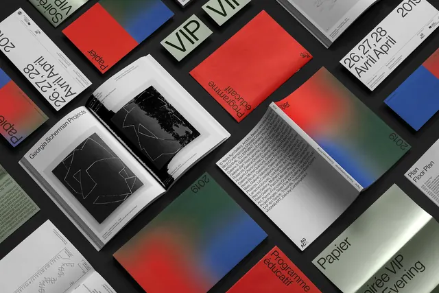
Array of printed collateral for an art fair with bold red, blue, and gradient covers, technical geometric line drawings, and dense text layouts.
Summary
Comprehensive printed collateral system for the Papier contemporary art fair. Visible pieces include catalog covers with bold red and blue color blocks, gradient backgrounds, geometric line drawings in black on white, dense justified body text, event dates, posters, and coordinating stationery. Color palette is limited to red, blue, black, white with subtle gradients.
Visual description
Shot from above on a dark background, the collateral pieces are arranged to show system coherence. Bold color blocking dominates: large areas of red, blue, and white create visual hierarchy and excitement. Geometric line drawings—triangles, angular polygons, abstract compositions—appear in black on white sections, providing conceptual and visual contrast to the solid colors. Typography is precise and contemporary, using white or dark sans-serif in justified layouts with generous leading. The density of information varies: cover pieces are bold and minimal, interior pages are information-rich. Gradients appear on some covers, creating subtle movement between the primary colors. The overall design language is contemporary, geometric, and technical—feeling modern and culturally sophisticated while remaining accessible.
Key takeaway
A coherent identity system using color blocking, geometric abstraction, and precise typography creates a sophisticated, recognizable brand presence. The contrast between vibrant color and technical drawing maintains visual interest and sophistication. Strategic constraint—limited palette, consistent geometric forms, restrained typography—actually strengthens brand recognition and impact. The system feels larger and more ambitious than the sum of its parts.
Reuse notes
Excellent reference for comprehensive identity systems, art fair branding, cultural institution collateral, or contemporary design that balances boldness with refinement. Demonstrates: strategic color use across multiple applications, how geometric forms can represent abstract concepts (art, culture, innovation), how information hierarchy can support brand aesthetic. Perfect for: museums, galleries, cultural events, contemporary brands, tech companies, or any organization wanting to communicate sophistication and cultural relevance. The color palette and geometric approach are adaptable to various industries while maintaining contemporary appeal. Demonstrates that constraint and systematic thinking create stronger brands than excessive ornamentation.
More like this



Keep what you find
A free account saves references to boards and can send you a weekly email of picks based on what you save.
To see every result, go Pro.