Preview image. Unlock full-res
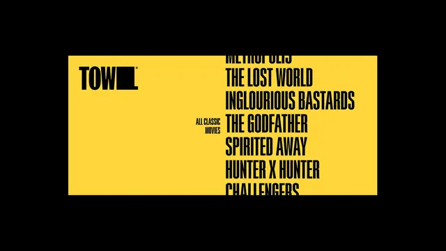
Yellow panel on black with the shortened mark top left and a column of film titles in heavy condensed caps running off the top and bottom edges.
More like this
See all

Summary
A yellow panel floating on black that pairs the compact mark with a tall column of film titles set large enough to break the panel edges.
Visual description
A wide yellow rectangle sits centered on a black field with black margins on all four sides. In its upper left, the shortened mark reads "TOW" in heavy black condensed caps followed by the solid black block that stands in for the missing letters, with a small registered symbol at its top right. Roughly two thirds across, a small two line label in black caps reads "ALL CLASSIC MOVIES", set at caption size. To its right runs a left aligned column of film titles in the same heavy condensed caps at a much larger size, one per line, tightly leaded so the lines nearly touch: a partly cropped title at the top, then "THE LOST WORLD", "INGLOURIOUS BASTARDS", "THE GODFATHER", "SPIRITED AWAY", "HUNTER X HUNTER", and a final line cut off by the panel's bottom edge. The first and last titles run past the yellow onto the black, so the list reads as a continuing scroll rather than a finished set. Only black and yellow appear.
Key takeaway
Letting the list overrun the colored panel at both ends implies an endless catalogue with no arrows, counters or ellipses. The small caption anchoring a huge column is a cheap way to build hierarchy inside a single typeface.
Reuse notes
Good for programme announcements, lineup reveals and catalogue pages where the titles themselves are the content. Works only with a very tight condensed face where long titles still fit on one line. Two colors are essential; adding a third would break the overrun illusion.
More like this

Keep what you find
A free account saves references to boards and can send you a weekly email of picks based on what you save.
To see every result, go Pro.