Preview image. Unlock full-res
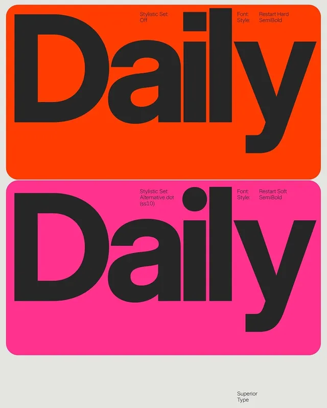
Wordmark design system showing two vibrant color variations on neon orange and hot pink backgrounds with decorative geometric accents.

Summary
A typography-forward wordmark system showcasing two color variations (neon orange and hot pink) of the word "Daily" with supporting design information and decorative geometric elements.
Visual description
Two rounded-rectangle cards stacked vertically, each displaying the word "Daily" in a bold, modern sans-serif typeface in black against vibrant backgrounds. The top card uses neon orange (#FF4500) with metadata about the stylistic set and font (Restart Hard SemiBold) in the upper right. The bottom card uses hot pink (#FF1493) with alternative styling information (Restart Soft SemiBold with ss10) and includes a decorative black circle accent. Both cards have smooth rounded corners. Light gray background area below. Attribution "Superior Type" appears at bottom.
Key takeaway
The elegant use of contrasting bright colors to showcase typographic variations, with supporting metadata integrated into the design. The geometric simplicity and bright palette make the typography the undeniable focal point.
Reuse notes
Effective for branding systems showing multiple color applications or stylistic variations of a wordmark. The layout clearly separates visual hierarchy from metadata. Works well for typography-focused presentations, design case studies, or branding guidelines. The neon palette is bold and youthful; scale accordingly for context.
More like this


Keep what you find
A free account saves references to boards and can send you a weekly email of picks based on what you save.
To see every result, go Pro.