Preview image. Unlock full-res
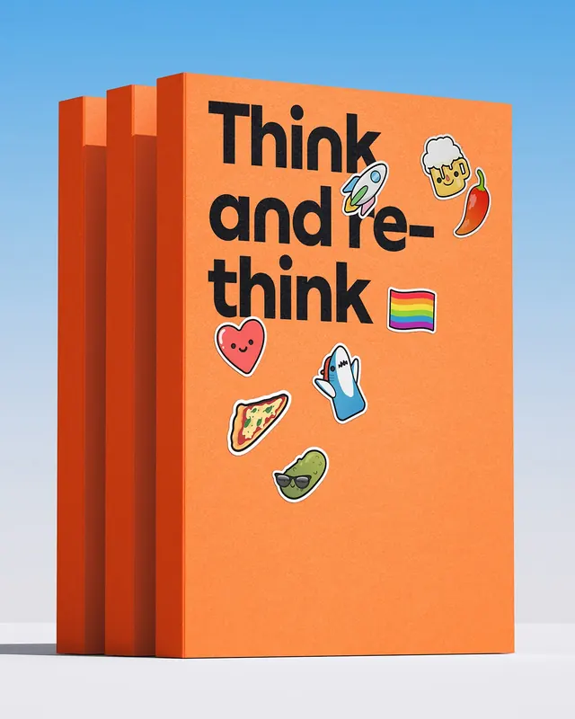
Three stacked orange brand books shot against a sky gradient, their covers carrying an oversized black headline and scattered glossy character stickers.
More like this
See all

Summary
A portrait product shot of three identical orange brand books standing in a row, front cover facing camera, combining a heavy black headline with a loose scattering of glossy cartoon stickers.
Visual description
The frame is vertical. Behind the books a soft gradient runs from a saturated sky blue at the top to near white at the horizon, with a pale grey floor and a short cast shadow to the right. Three thick volumes stand upright, offset so the two behind peek out to the left and reveal their orange spines and slab-like thickness. The covers use a flat, slightly textured orange. Top left, the headline "Think and re-think" is set in a heavy black grotesque at very large size, ranged left, with tight leading and a hyphen breaking "re-think" across two lines so the type fills the upper half edge to edge. The lower half is left open and populated with nine glossy stickers, each drawn with a black outline and a white die-cut border, dropped at slight random rotations: a rocket, a foaming beer mug with a face, a red chilli, a rainbow flag, a smiling heart, a shark, a pizza slice, and a pickle wearing sunglasses. No logo appears on the cover.
Key takeaway
A rigid typographic block up top and a deliberately unruly sticker field below, in the same frame, is the whole brand argument in one object. The stickers are placed off grid at varying angles so the cover looks played with rather than laid out, while the headline keeps it from reading as clutter. Cropping the type hard against the top edge and letting the hyphen do the line break gives the cover its energy.
Reuse notes
Reach for this when a brand book, culture manual or internal handbook needs to feel like an object people will actually pick up. Works best when the sticker set is a real, reusable asset library rather than one-off art. The scattered placement needs a genuinely empty lower half to breathe, so it will not survive a cover that also has to carry a logo, subtitle and author line.
More like this
Keep what you find
A free account saves references to boards and can send you a weekly email of picks based on what you save.
To see every result, go Pro.