Preview image. Unlock full-res
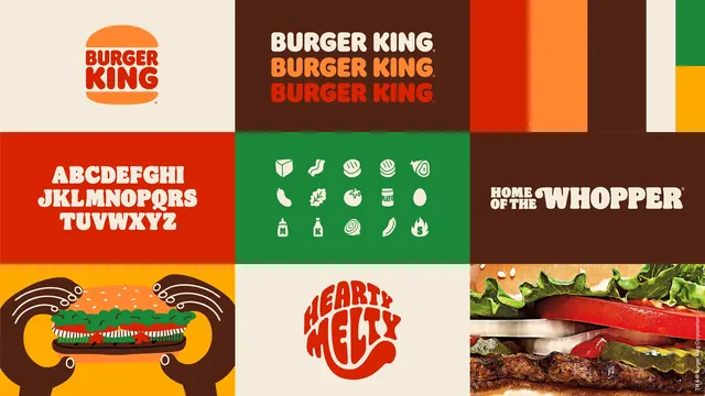
Tiled overview of the Burger King identity showing the bun logo, wordmark colorways, a custom alphabet, ingredient icons and campaign lockups.
More like this
See all
Summary
A nine-tile contact sheet of one identity system, each tile carrying a single asset: the bun-sandwich logo, the wordmark in three colorways, the custom alphabet, the ingredient icon set, campaign lockups, illustration and food photography.
Visual description
The frame is split into a three-by-three arrangement of unequal color blocks. Top left, on cream, the logo sits centered: a red rounded wordmark stacked over two lines and held between an orange top and bottom bun. Top center, on dark brown, the wordmark repeats three times in cream, orange and red with a registered mark. Top right, vertical color bars step through red, orange, brown, cream, green and yellow as a swatch strip. Middle left, on red, the custom alphabet runs A to Z in cream across three lines, with soft slab-like terminals and tight bulging counters. Middle center, on green, fifteen white ingredient icons sit in a three-row grid: bun, bacon, onion rings, patty stack, avocado, pickle, lettuce, tomato, mayo jar, egg, mustard, ketchup, sliced onion, sausage and a flame. Middle right, on brown, the cream lockup reads HOME OF THE WHOPPER in mixed sizes. Bottom left, on yellow, a flat illustration shows two brown hands with white outline detail lifting an open burger. Bottom center, on cream, a red circular lettering lockup reads HEARTY MELTY with letterforms bent to fill the circle. Bottom right, an extreme close-up photograph of lettuce, tomato, cheese and a charred patty fills the tile.
Key takeaway
One frame carries the whole system because each tile is limited to a single asset and a single flat background pulled from the same six-color palette. The rounded, food-warm letterforms and the icon set share the same weight and corner radius, so the identity reads as one voice across type, symbol and illustration.
Reuse notes
A strong model for an identity summary board or a case-study opener: use it when you need to show logo, palette, type, icons and imagery at once without a multi-page deck. Depends on a genuinely distinct custom typeface to hold the tiles together, and the tight tiling leaves no room for explanatory captions.
More like this

Keep what you find
A free account saves references to boards and can send you a weekly email of picks based on what you save.
To see every result, go Pro.