Preview image. Unlock full-res
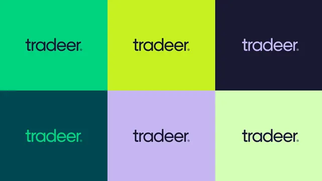
A six-panel color grid showing the lowercase geometric tradeer wordmark in every approved foreground and background pairing.
More like this
See all
Summary
The wordmark shown six times on a flat three-by-two color grid, one approved foreground and background pairing per cell and nothing else in the frame.
Visual description
The image is divided into six equal rectangles with no gutters, three across and two down. The top row runs bright emerald, acid lime and near-black navy; the bottom row runs deep teal, lilac and pale mint. Centred in each cell, at the same size and optical position, is the wordmark: lowercase, set in a geometric sans with generous round bowls, a single-storey a, a lowered dot on the i and a small raised registered symbol at the right of the final letter. The color of the mark changes per cell to hold contrast: navy on emerald, navy on lime, lilac on navy, emerald on deep teal, navy on lilac and navy on pale mint. There is no other type, no rules, no captions and no shadow, so the panels butt directly against one another and the palette reads as one continuous field.
Key takeaway
A gutterless grid of solid panels is the most efficient way to specify approved color pairings, because every combination is seen at final size and the panels compare directly against their neighbours. Rotating which color is foreground and which is background across the six cells proves the mark works in both directions.
Reuse notes
The standard reference page to produce for any identity with more than two brand colors, and a useful asset to hand straight to a guidelines deck. Include only pairings that pass contrast in practice, since publishing a grid implies every cell is approved. If the mark has an icon lockup as well, produce a matching grid rather than mixing lockups into this one.
More like this





Keep what you find
A free account saves references to boards and can send you a weekly email of picks based on what you save.
To see every result, go Pro.