Preview image. Unlock full-res
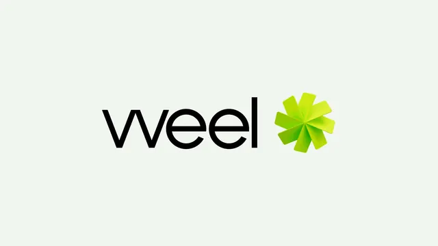
Horizontal lockup pairing a thin geometric lowercase wordmark with a green gradient pinwheel asterisk on an off-white ground.
More like this
See all
Summary
A clean primary lockup: the lowercase word "weel" in a light geometric sans, followed by a bright green eight-blade pinwheel that acts as the brand's standalone mark.
Visual description
The frame is a wide, pale mint-tinted off-white field with the lockup centred and held at generous clear space. "weel" is set lowercase in near black, in a thin, wide geometric sans built from near-perfect circles; the opening w reads as two joined v strokes with pointed junctions, and the two e counters and the straight l terminal all share the same hairline weight. To its right, separated by roughly one character width, sits the symbol: eight rounded-rectangle blades radiating from a common centre, each rotated slightly so they overlap in a clockwise spiral, like an asterisk caught mid-turn. Each blade carries its own lime-to-mid-green gradient, lighter at the outer tip and deeper where the blades converge, giving the flat shape a sense of folded paper depth. The mark's cap height slightly exceeds the wordmark's x-height, so it reads as a companion rather than a punctuation mark.
Key takeaway
The gradient runs per blade rather than across the whole mark, which is what turns a flat asterisk into something that appears to rotate and catch light. A hairline wordmark next to a fully saturated symbol lets the colour carry all the brand recognition while the type stays quiet.
Reuse notes
Good template for a fintech or payments identity that needs one memorable standalone glyph for app icons and favicons alongside a restrained wordmark. The hairline weight will disappear at small sizes or in reverse on dark, so plan a heavier secondary cut; the per-blade gradients also need a flat single-colour fallback for embroidery, foil and single-ink print.