Preview image. Unlock full-res
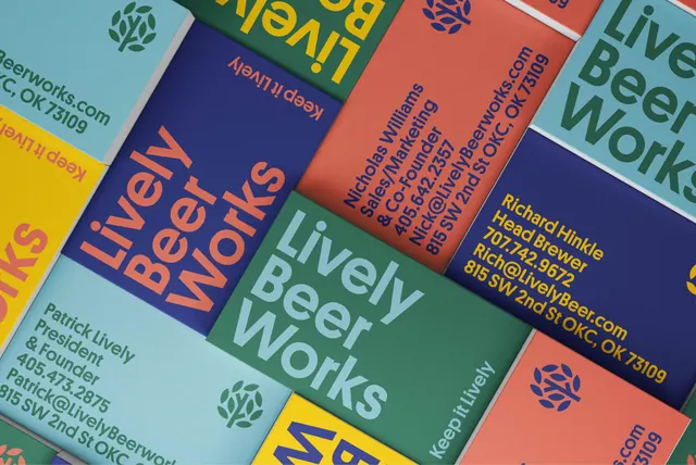
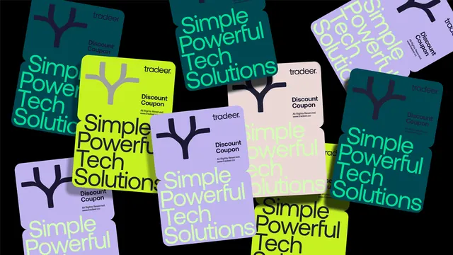
Overlapping business cards fanned across the frame showing the brewery identity in five colorways with vertically set contact details.
More like this
See all
Summary
A dense flat lay of business cards laid at a shared diagonal, each pairing one background color with one contrasting ink to show how far the brewery palette stretches across a single format.
Visual description
Cards overlap and run off all four edges, rotated to roughly the same angle so the whole frame reads as one diagonal grid. Backgrounds cycle through navy, coral, warm yellow, forest green, mid teal and pale sky blue, and each card carries type in a different palette color rather than a fixed ink. Name cards set the brand across three stacked lines in a heavy sans at near-cap-height, filling the card corner to corner. Contact cards rotate the type ninety degrees and set name, role, phone, email and a street address as a tight flush-left block reading bottom to top. The small tree symbol appears alone in a corner on some cards, and the line "Keep it Lively" runs along an edge on others. Every card is flat stock with no finishes, so color and type scale do all the work.
Key takeaway
One layout logic, six color pairings: the identity flexes entirely through recombination of a fixed palette rather than through new artwork. Setting the contact block vertically turns a mundane information card into a graphic panel and lets the name cards stay maximally large.
Reuse notes
Useful when a stationery system needs variety across many people or venues without printing bespoke designs. Vertical contact type is a legibility trade, so keep the line count low and the type size generous. The palette needs enough mid-tone spread for every color pairing to hold contrast.
More like this

Keep what you find
A free account saves references to boards and can send you a weekly email of picks based on what you save.
To see every result, go Pro.