Preview image. Unlock full-res
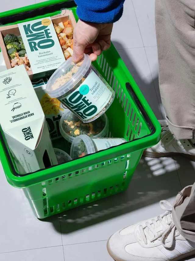
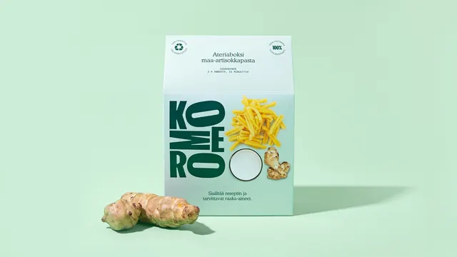
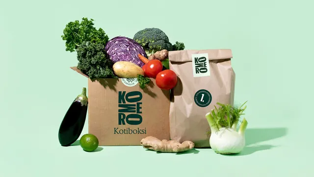
The full Komero packaging range lined up on mint green and surrounded by raw vegetables, unified by a stacked dark green wordmark.
More like this
See all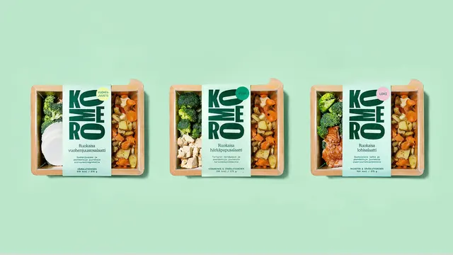
Summary
A family shot of the whole ready-meal range on a flat mint background, with the wordmark set as a stacked letter block that repeats at every pack size.
Visual description
Four pack formats stand in a row on a seamless mint green sweep: a stack of three clear plastic tubs with pale mint wrap labels, a square mint carton for a meal kit, and a gable-top carton at right. The wordmark is set in a heavy condensed dark green sans and stacked into a compact block, the letters KO, MO, ME, RO and O arranged in rows so the counters of the round letters line up as a vertical rhythm. Small solid dots sit at the top right of each pack carrying diet call-outs, teal for vege and mustard yellow for chicken. Product names run in a lighter serif-free type below the mark with two or three lines of small descriptive copy under that. The meal-kit box adds cut-out photography of rice, lime, herbs and mushrooms sitting on the baseline of the wordmark block, plus two circular seals in the top corners for recycling and satisfaction claims. Loose produce frames the group at both ends: curly kale, a striped yellow squash and ginger at left, a lime, tomatoes on the vine, jerusalem artichoke, halved red cabbage and a coconut at right. Lighting is soft and even with short shadows pooling toward the camera.
Key takeaway
The stacked letter block does the heavy lifting: it fills a tall label on a tub and a wide face on a box with no redraw, and the two-tone mint plus deep green keeps every format visibly one family. The coloured dot is a cheap, legible system for variant coding across a whole range.
Reuse notes
A strong reference for a food range that needs one mark to survive very different pack shapes and proportions. The raw produce styling sells freshness without photographing the cooked food. Note the label copy is in Finnish, so read this for structure and hierarchy rather than wording.