Preview image. Unlock full-res
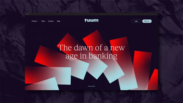
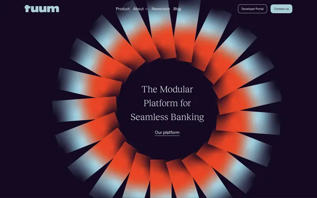
Browser mockup of a dark banking homepage whose hero is filled with red and ice-blue gradient rectangles fanned behind a serif headline.
More like this
See all
Summary
A website hero shown in a browser frame, where the brand's rotating rectangle motif is blown up into overlapping gradient blades that fill the viewport behind the headline.
Visual description
A browser window with three dots in its title bar floats on the darkened rock texture used across the identity. Inside, the page is near-black aubergine. The top bar carries left-aligned nav links Product with a small red caret, Team, Contact and Blog, a centred pale blue lowercase wordmark, and at the right an outlined "Login" pill next to a filled ice-blue "Sign up" pill. Filling the centre, roughly a dozen large rectangles are rotated at loose angles and layered over each other, each running a grainy gradient from saturated red or pale ice blue into transparency, so the cluster reads as an exploding pinwheel. Over it, the headline "The dawn of a new age in banking" sits centred on two lines in a white high-contrast serif. A small "Scroll down" label and a thin vertical rule mark the bottom centre.
Key takeaway
The logo's rotating-blade construction is scaled up into full-bleed art direction rather than being repeated as a small mark, so the hero is unmistakably branded with zero decorative extras. Grain across the gradients stops the shapes reading as flat vector fills.
Reuse notes
A good pattern for a fintech or infrastructure homepage that needs to feel serious but not sterile. The serif headline only survives because it sits on the darkest part of the composition, so the blade cluster has to be arranged around the type, not under it.
More like this

Keep what you find
A free account saves references to boards and can send you a weekly email of picks based on what you save.
To see every result, go Pro.