Preview image. Unlock full-res
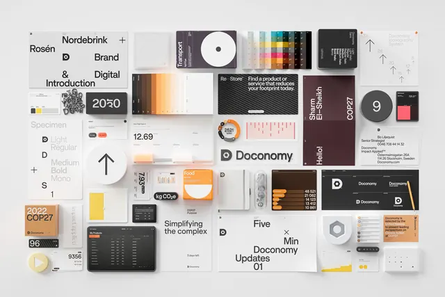
Overhead flat-lay of extensive Doconomy brand collateral including logos, color swatches, typography specimens, printed matter, and UI mockups.
Summary
Comprehensive overhead arrangement of Doconomy brand identity materials: logos, color palettes, type specimens, stationery, booklets, and digital interface mockups laid out on a white surface.
Visual description
Dozens of physical and printed items are neatly arranged in a grid-like composition on a plain white background. Visible elements include logo lockups with a small circular "D" mark and the word "Doconomy", gradient and solid color swatches, font weight charts, business cards, envelopes, large posters with headlines like "Re-Store" and "COP27", UI dashboard mockups with charts and orange accents, stickers, and physical objects such as a chain and a pencil. The overall palette is neutral grays, off-white, warm terracotta, and gold accents. Clean sans-serif typography throughout.
Key takeaway
A dense yet organized showcase of a complete visual identity system that balances print, digital, and physical touchpoints with a consistent restrained palette and geometric logo.
Reuse notes
Excellent reference for brand identity presentations, flat-lay moodboards, or examples of how to display a full system (logo, color, type, applications). The neutral warm palette and clean layout suit sustainability, fintech, or consulting brands. Works best in light, spacious contexts.
More like this








Keep what you find
A free account saves references to boards and can send you a weekly email of picks based on what you save.
To see every result, go Pro.