Preview image. Unlock full-res
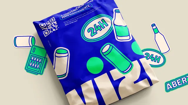
Interior photograph of a mint-green refrigerator door with a loose cluster of blue and green brand stickers applied to it.
More like this
See all
Summary
The sticker set shown where it is meant to end up, clustered at eye height on a domestic fridge door.
Visual description
The frame is filled by the front of a mint-green retro-style refrigerator with a vertical seam down the right and a dark handle. To the left, a wall painted with oversized green leaf shapes and, below it, a dark red wooden sideboard carrying a small pink dish. Seven stickers are arranged in a loose overlapping cluster near the centre of the door, each with a white or green cut border: "ABERTO" in a tilted plaque, a rounded "TA VAZIA?" pill in cream with blue caps, a "VAI DE" pill in blue with cream caps, the "vizi" wordmark on a cream ground with green dots over the i's, an upright can, a bottle, and a "24H" oval. Light falls from the left and the greens of the door and the stickers sit close in tone.
Key takeaway
Photographing merchandise in the place it will actually live, rather than on a sheet, does the persuasion that a flat lay cannot. Letting the stickers overlap at slightly different angles reads as user behaviour instead of art direction.
Reuse notes
Useful for the applied-identity section of a case study, and as a reference for any campaign whose deliverable ends up in someone's kitchen. The green fridge is a lucky set choice that nearly camouflages the green stickers, so on a neutral appliance the cluster would read much harder. Copy is Portuguese.