Preview image. Unlock full-res
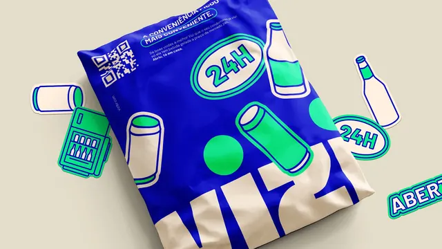
Animated logo reveal in which a heavy cream wordmark draws itself onto an electric blue field and two green dots pop in above it like eyes.
More like this
See all

Summary
A looping wordmark animation where four heavy cream letters grow up out of the baseline in sequence and two green dots drop in above the vertical strokes.
Visual description
The frame is a flat electric ultramarine blue with no texture or gradient. The loop opens empty, then a thin cream bar appears at the baseline and the letters V, I, Z and I extend upward from it left to right, each one snapping to full height a beat after the last. The finished wordmark is set in a very heavy geometric all-caps sans with squared corners, tight spacing and stems that flare slightly wider at the top than the bottom, giving each letter a subtle taper; the Z is drawn with flat horizontal arms and a thick diagonal. Once the letters land, two circular dots in a bright mint green pop in above the two vertical strokes, sitting clear of the cap height and reading as a pair of eyes over the word. The lockup holds centred and slightly left of the optical middle for most of the loop, then the letters retract back into the baseline and the dots fade, leaving the blue field empty before the cycle repeats.
Key takeaway
The two floating dots do all the personality work: the wordmark itself is neutral and industrial, and a pair of green circles at eye height turns it into a face without drawing one. Building the letters upward from a baseline bar rather than fading them in reads as something rising or filling, which suits a product built around storage.
Reuse notes
Reach for this when a consumer hardware or appliance brand needs to feel approachable without going illustrative. The single accent colour used only for the dots is what keeps it from getting busy, so resist adding a third colour. Needs a saturated flat ground; the cream letters lose their punch on white and the mint dots need the blue to sing.