Preview image. Unlock full-res
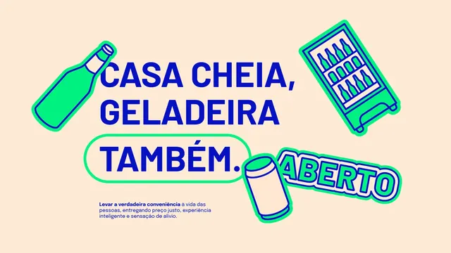
Cream brand layout with a blue headline, an outlined pill around the last word, a small mission paragraph and floating outline illustrations.
More like this
See all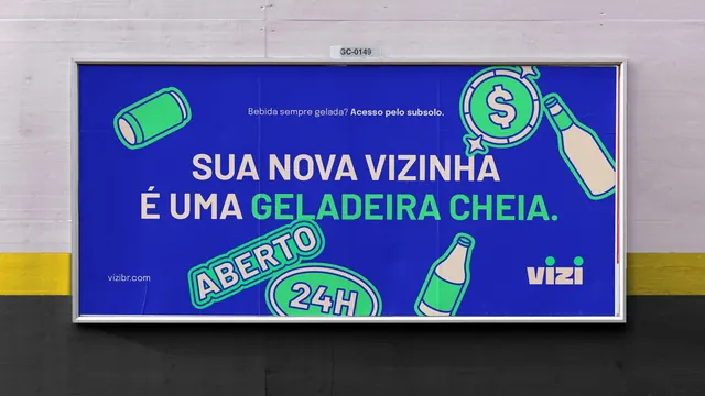
Summary
A key-message layout that inverts the campaign's usual colourway, running blue type and green illustrations on warm cream instead of on blue.
Visual description
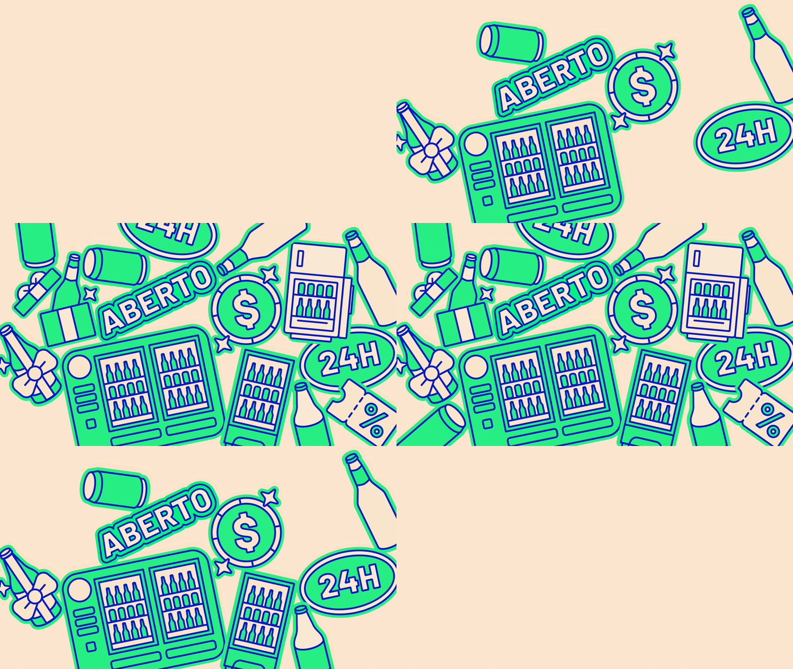
The ground is flat warm cream. The headline "CASA CHEIA, GELADEIRA TAMBEM." sits left of centre in heavy blue condensed caps over three lines, with the final word and full stop enclosed in a wide green rounded-rectangle outline that extends well past the type on both sides. Beneath it, four lines of small blue body copy open with a bold phrase then continue in regular weight, a short mission statement in Portuguese. Outline illustrations surround the type: a tilted bottle at upper left, a tall fridge stocked with bottles at upper right, and a tipped can at lower centre, each drawn as green fill with a blue outline and a cream inner highlight. Bottom right holds an "ABERTO" plaque tilted upward with a layered cream and green outline. No wordmark, no url.
Key takeaway
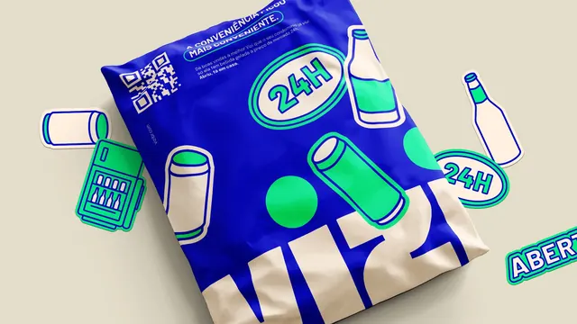
The green outline pill around one word gives the layout a focal point without changing type colour or size, and it is the same shape language as the sticker badges elsewhere in the system. Flipping ground and ink from the blue posters proves the palette works both ways.
Reuse notes
A ready template for the manifesto or values page of a brand deck, or a landing page section that needs a claim plus a short paragraph. The illustrations do the decorating, so the layout will feel empty if used without them. Do not stack several of these in a row; the outline pill loses its emphasis when repeated.