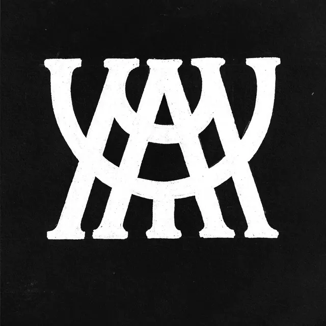
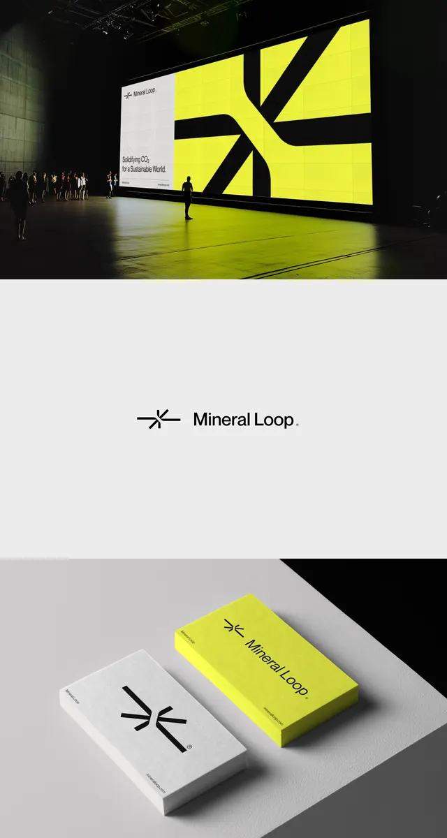
Geometric monogram combining curved and linear letterforms into an abstract mark, rendered in white on black background with textured finish.
Summary
A geometric monogram logo combining abstract curved and linear forms into a unified mark, emphasizing modularity and contemporary minimalist branding principles.
Visual description
A black background with a centered white logomark composed of overlapping or adjacent geometric letterforms. The mark features both curved (resembling a rounded "B" or "D") and rectilinear elements (sharp angles and straight strokes) layered or interlocking to create visual unity. The letterforms are evenly weighted with consistent stroke width throughout. The composition is symmetrical and balanced, with the mark fitting comfortably within an imaginary square bounding box. A subtle texture or halftone pattern appears visible on the white letterforms, suggesting either a screen-printed finish or paper texture visible under the white ink. The black-and-white contrast is absolute, with no gray tones in the mark itself (though shadows appear in the mockup image). The overall impression is of a premium, modern logo suitable for technology, design, or contemporary brands.
Key takeaway
The blending of organic curves and rigid geometry into a single mark creates visual interest without ornamentation—modularity and simplicity are the design moves, allowing the logo to scale and reproduce cleanly across any medium.
Reuse notes
Strong foundation for a design studio, tech company, or contemporary brand. The monochrome construction ensures versatility across backgrounds and media. The geometric approach suggests precision and professionalism without coldness (the curves soften the rectilinear geometry). Works exceptionally well at small sizes (favicon, app icon, watermark) and at large scales (signage). The balanced symmetry makes it memorable and recognizable. Consider whether the letterform basis is memorable as an abstract shape (particularly important if the brand name changes or the verbal identity shifts). The texture suggests quality and consideration but may not reproduce cleanly in all applications (test across digital, print, embroidery, etc.).