Preview image. Unlock full-res
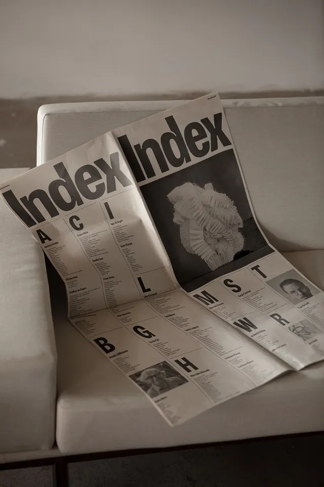
A comprehensive magazine layout and indexing system featuring bold sans-serif typography organizing curated content sections across cream paper with black text and integrated imagery.
Summary
A sophisticated magazine and content indexing system using bold sans-serif typography to organize sections alphabetically, combining clean layout structure with integrated photography and portraiture.
Visual description
Cream-colored paper ground with black typography and imagery. Bold, geometric sans-serif headers spell out "Index" repeatedly at the top of pages. Content is organized into alphabetical sections labeled A, B, C, G, H, L, M, S, T, W, R, each with accompanying text listings. Black and white photographs and portrait studies are positioned throughout, creating visual rhythm against the typographic hierarchy. The layout follows a deliberate grid structure, balancing dense text blocks with breathing room. Type remains consistently sized and weighted, allowing the alphabetical progression and imagery to drive visual interest.
Key takeaway
Using typographic hierarchy and alphabetical organization as a organizing principle for editorial content. The restraint in using only black and cream creates elegance, and the integration of imagery breaks up text density without disrupting the systematic approach.
Reuse notes
Effective for publication design, archives, or institutional catalogs where systematic organization and accessible navigation are priorities. Works well for cultural organizations, galleries, libraries, or editorial projects. The monochrome palette is versatile and timeless. Scale the type weight and section sizing to adapt to different content volumes.
More like this


Keep what you find
A free account saves references to boards and can send you a weekly email of picks based on what you save.
To see every result, go Pro.