Preview image. Unlock full-res
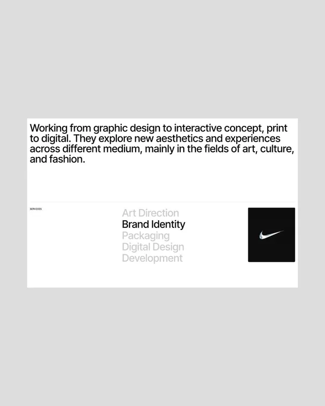
A studio about page where a bold intro paragraph sits above a services list whose items grey out except the active one, anchored by a small black product thumbnail.
Summary
A creative studio about block whose services menu greys every item except the active one, "Brand Identity," turning a plain list into a piece of hierarchy.
Visual description
A white content card sits on a light grey canvas. At the top, a four-line intro paragraph runs in a bold black sans-serif, left aligned and ranged at a comfortable measure, describing work that spans graphic design, interactive, print, and digital across art, culture, and fashion. A hairline rule separates it from a lower band. Below left, a tiny all-caps label reads SERVICES. A centered column lists Art Direction, Brand Identity, Packaging, Digital Design, Development, with every line in light grey except Brand Identity, which is solid black and bold to mark the active state. At far right a small black square thumbnail holds a white swoosh logo, the only image and the only dark mass on the right edge, balancing the type.
Key takeaway
The greyed-list active state: rendering the whole services menu in pale grey and promoting only the current item to bold black communicates focus and navigation without buttons, underlines, or color.
Reuse notes
Reach for this on an agency or studio about and services section, or as a hover and scroll interaction where each service highlights in turn. Keep the palette strictly monochrome so the single black thumbnail and the active line carry all the contrast. Works best with a strong, well-set paragraph up top to justify the negative space.
More like this


Keep what you find
A free account saves references to boards and can send you a weekly email of picks based on what you save.
To see every result, go Pro.