Preview image. Unlock full-res
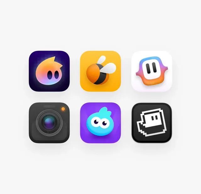
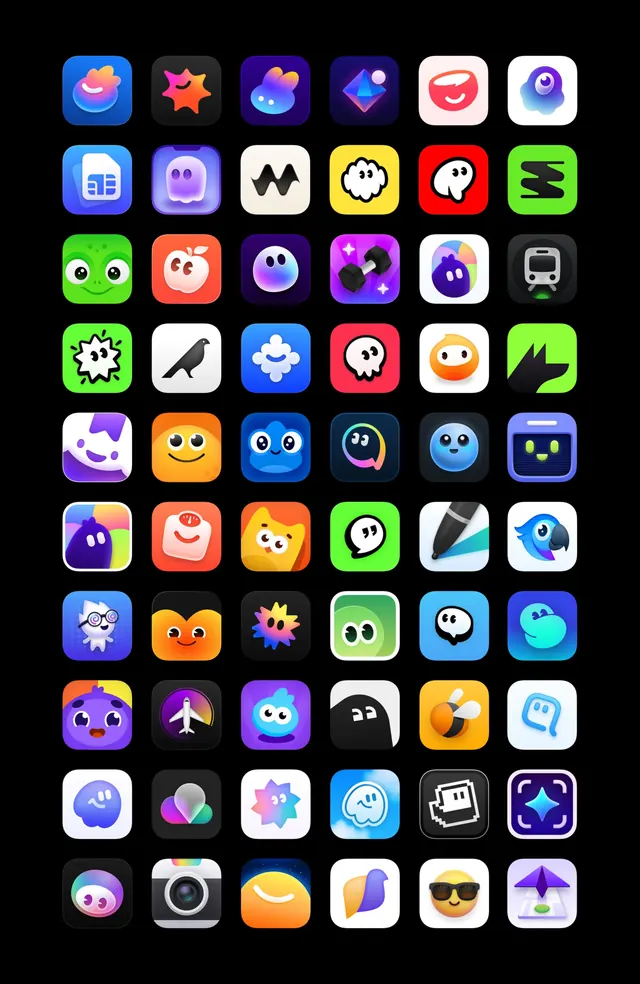
A set of six rejected app icon concepts featuring playful 3D characters and illustrative styles across varied color palettes.
More like this
See all
Summary
A set of six rejected app icon concepts featuring playful 3D characters and illustrative styles across varied color palettes.
Visual description
Six rounded-square app icons sit in a clean two-by-three grid on a pale gray background, each with a soft drop shadow and generous spacing. The top row shows an orange-pink gradient blob character on a deep navy-purple tile, a glossy bee on a yellow tile, and a rounded white-and-gradient mascot face with two dark bars for eyes. The bottom row shows a realistic dark camera lens, a cyan blob character with big googly eyes on a vivid purple tile, and a white pixel-art outline figure on a black tile. Each icon has a single centered subject with simple volumetric shading.
Key takeaway
Present icon explorations as an evenly spaced grid on a neutral ground with soft shadows, letting very different styles (3D, gradient, pixel, skeuomorphic) sit together as one comparable set.
Reuse notes
Reach for this as a identity system reference. Pairs with 3d, playful directions. Original by Dmitri.
More like this

Keep what you find
A free account saves references to boards and can send you a weekly email of picks based on what you save.
To see every result, go Pro.