Preview image. Unlock full-res
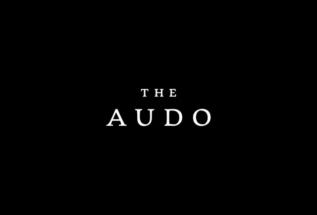
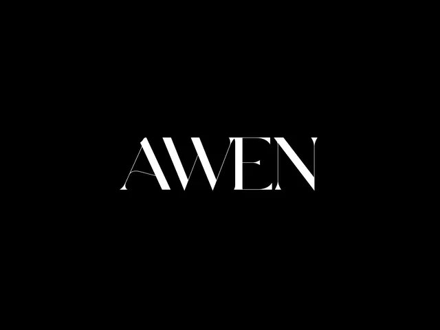
Minimalist serif wordmark with refined letterforms and subtle diagonal serifs on a pure black background.
Summary
A refined serif wordmark spelling "AWEN" with elegant, extended letterforms centered on a pure black field. The design prioritizes legibility through deliberate letter spacing and subtle diagonal line cuts at the corners of characters.
Visual description
Black background with a single centered wordmark in near-white sans-serif with serif characteristics. The typeface features tall, narrow proportions with a sophisticated stroke weight, and each letter is cleanly spaced. Diagonal cuts at character corners add geometric interest without disrupting readability.
Key takeaway
The power of extreme contrast (near-black and near-white) combined with ample negative space. The subtle serif flourishes—particularly the diagonal cuts—elevate a simple wordmark into a memorable mark without overcomplicating the form.
Reuse notes
Strong choice for luxury brands, design studios, or any premium positioning requiring understated elegance. The narrow proportions work best with short names or acronyms. Ensure adequate spacing around the mark to preserve its impact.