Preview image. Unlock full-res
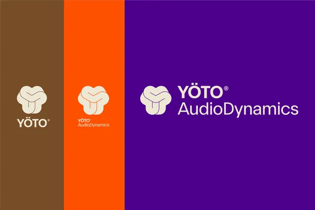
Three vertical color panels in brown, orange and violet showing the knot mark with the stacked and horizontal wordmark lockups in cream.
More like this
See all

Summary
Three lockup configurations shown side by side on three brand colors, scaling from mark plus short name up to the full horizontal signature.
Visual description
The canvas is split into three vertical bands of unequal width: a narrow warm brown at the left, a narrower bright orange in the middle, and a wide deep violet filling the right two thirds. All artwork is cream. On the brown band the rounded knot mark sits above "YÖTO®" in caps, centered. On the orange band the same mark sits above a two line lockup reading "YÖTO®" over "AudioDynamics" at small size. On the violet band the mark sits to the left of a large two line signature, "YÖTO®" over "AudioDynamics", set in a geometric sans with a generous cap height and the registered symbol tucked up after the O. The mark itself is a soft trefoil knot of three overlapping lobes with a fine interior line tracing the crossing, and on the violet panel that interior line picks up the background color rather than the cream.
Key takeaway
One mark, three sizes of accompanying name, arranged so the smallest lockup gets the narrowest panel and the largest gets the widest. The panel widths themselves communicate the hierarchy before you read anything. Letting the interior contour line drop out to background color keeps the mark from going solid at large size.
Reuse notes
A clean way to present lockup variants in a case study without drawing a clearance diagram. Copy the idea of pairing each variant with the color it is most likely to appear on. Cream on saturated color is the whole look here, so a pure white version would feel colder.