Preview image. Unlock full-res
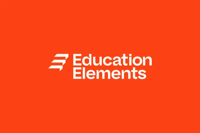
The Education Elements horizontal lockup, a stepped chevron mark beside a two-line bold sans wordmark, in cream on a flat orange red field.
More like this
See all
Summary
A clean presentation of the primary logo: an angular stepped mark locked to a two-line wordmark, reversed in cream out of a saturated orange red ground.
Visual description
Nothing else is in the frame. The lockup sits slightly above center on a flat orange red field with generous margins on all sides. The mark is built from three stacked horizontal bars cut on a diagonal so they read as a staircase or a forward chevron, with the top bar carrying a small notch and the bottom bar extending into a downward tail. To its right, "Education" and "Elements" stack on two lines in a heavy geometric sans with very tight leading, so the two words form a compact rectangle roughly the height of the mark. Letterforms have a large x-height, near-flat terminals and closed apertures. Optical spacing between mark and wordmark is about one bar height. Cream, not pure white, keeps the contrast warm rather than glaring.
Key takeaway
Setting the wordmark on two lines makes a long, awkward name into a stable block that pairs cleanly with a compact mark, and it gives the lockup a near-square footprint that drops into avatars and small placements. The cream-on-orange reverse is the whole identity in one gesture: warm, loud, and only two colors.
Reuse notes
Reach for this when a two-word client name is too long for a single-line lockup. The mark is legible enough to run alone as an app icon or badge, which the rest of the project relies on. Works best on saturated flat ground; on photography the mark's thin diagonal cuts would need a containing shape.