Preview image. Unlock full-res
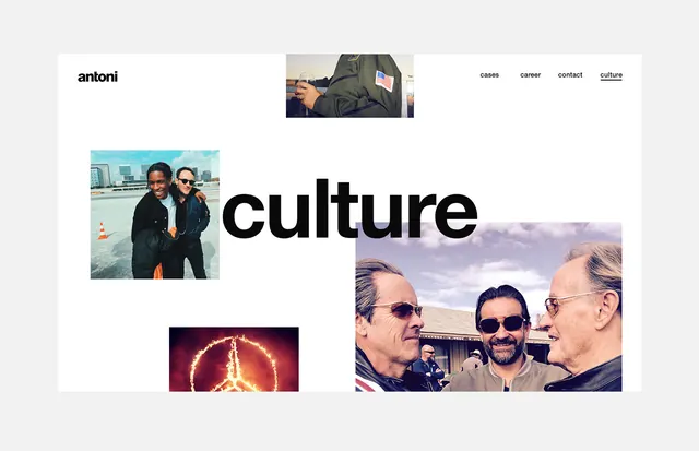
Editorial grid layout combining oversized typography, documentary photography, and accent imagery for an agency portfolio.
Summary
An editorial grid composition for an agency website combining documentary photography, large-scale typography, and accent imagery to showcase the work "culture."
Visual description
A light grey background hosts a scattered, asymmetric grid. Top left sits a small wordmark "antoni" in simple sans-serif. Three documentary photographs are placed organically: a team portrait, a candid street moment, and a larger group shot. The word "culture" is centered in bold, oversized black sans-serif type, acting as the visual anchor. Additional small photographs and navigation links (cases, career, contact, culture) are positioned around the layout. The spacing is generous, creating a sense of editorial sophistication.
Key takeaway
Effective use of oversized typography as a compositional anchor point. The asymmetric, scattered arrangement feels both modern and approachable. Documentary imagery humanizes the brand without requiring styled photography. The layout prioritizes spatial breathing room and clear hierarchy despite the collage effect.
Reuse notes
Strong for creative agencies, portfolios, and corporate culture sections. The technique works well when the supporting images have strong editorial or documentary character. Suits brands that want to feel accessible and human while maintaining professional credibility. Ensure typography has sufficient weight to anchor the composition; delicate type gets lost amid competing images. Works best with 4-6 supporting images and 1-2 large text elements.
More like this
Keep what you find
A free account saves references to boards and can send you a weekly email of picks based on what you save.
To see every result, go Pro.