Preview image. Unlock full-res
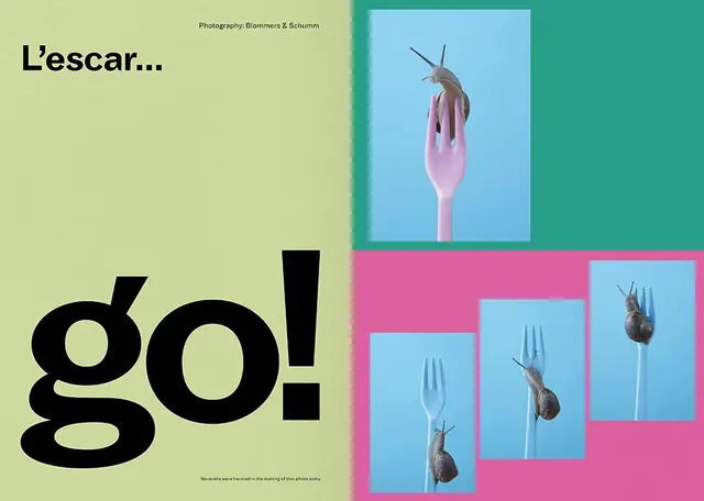
Colorful editorial design with bold typography and playful product photography arranged across split and nested layouts.
Summary
A vibrant editorial spread using bold display type against a lime-green background paired with a magenta and teal layout section containing repeated product photography.
Visual description
Left half features oversized black sans-serif text reading "go!" on a lime-green background with smaller text "L'escar..." and a photo credit. Right side is split into two sections: an upper light-blue rectangle containing a single close-up product shot of a snail on a pink fork, and a lower magenta area with a grid of three nested blue rectangles showing variations of the same product photograph. Color blocking is sharp and intentional, with no soft transitions.
Key takeaway
The technique of combining typographic dominance with geometric color blocking and repetitive photography to create visual rhythm. The split layout lets the eye move between conceptual copy and visual confirmation.
Reuse notes
Works well for editorial, product showcases, or conceptual layouts where typography and image need equal hierarchy. The high saturation requires confident color choices and strong photography to balance. Best suited for print or high-contrast digital contexts.
More like this
Keep what you find
A free account saves references to boards and can send you a weekly email of picks based on what you save.
To see every result, go Pro.