Preview image. Unlock full-res
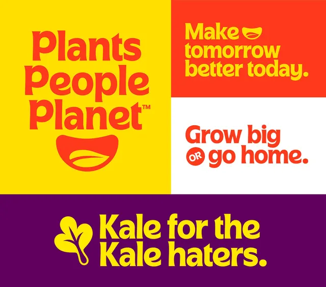
Four-panel consumer campaign for a plant/food brand using primary colors, bold sans-serif headlines, and playful geometric marks (smile, lines, leaf) across distinct color-blocked quadrants.
Summary
A bold four-panel social campaign for a plant-based food brand built on high-contrast color blocking, playful geometric marks, and declarative headlines in oversized sans-serif.
Visual description
Four equal quadrants, each a solid primary or neutral color background with white or yellow headline text and a simple geometric icon. Top left: yellow background with "Plants People Planet" in red sans-serif and a red curved smile mark below. Top right: red background with "Make tomorrow better today" in yellow sans-serif. Bottom left: white background with "Grow big or go home" in red sans-serif, accompanied by a circular "or" badge with white outline. Bottom right: deep purple background with "Kale for the Kale haters" in yellow sans-serif, paired with a yellow leaf line-mark. The typography is bold, sans-serif, and fully capitalized or titlecased for maximum legibility. All geometric marks are simple, single-line or solid shapes that work at small scale.
Key takeaway
The four-panel grid as a compact, scannable format for multiple campaign messages. High-contrast primary colors ensure immediate visual impact and social-media legibility. The simple geometric marks (smile, leaf, circular badge) are memorable, scale down well, and function as brand atoms across other applications. Oversized typography commands attention without requiring hierarchy tricks.
Reuse notes
Perfect for social-media campaigns, product packaging quad-display, or signage. The high-contrast colors and bold type work across digital and print at any scale. The playful geometric language is ideal for consumer brands in food, fitness, and lifestyle sectors seeking approachability without cuteness. The four-quadrant structure is easy to expand or remix with new messaging while maintaining consistent visual logic.
More like this


Keep what you find
A free account saves references to boards and can send you a weekly email of picks based on what you save.
To see every result, go Pro.