Preview image. Unlock full-res
A 24-slide investor pitch for fresh cat food brand Smalls that pairs a bright lemon-yellow accent system with airy pastel content slides, a single yellow data color, and studio product photography of cats and raw meat.
Summary
A 24-slide seed/growth investor pitch for Smalls, a direct-to-consumer fresh cat food brand. Its whole identity rests on one move: a saturated lemon-yellow that is used as the section-divider background, the single data color in every chart, the highlighter marker on key phrases, and the soft drop-shadow under every white card. Content slides sit on rotating airy pastels so the yellow always reads loud.
Visual description
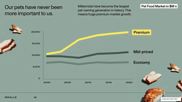
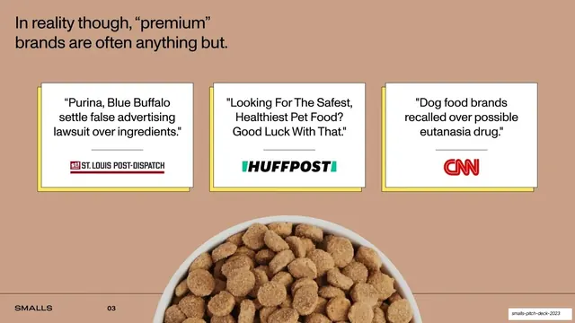
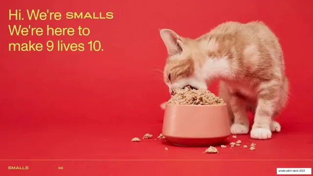
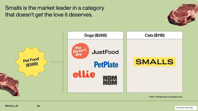
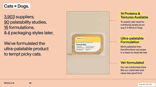
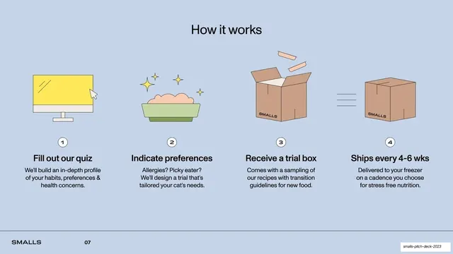
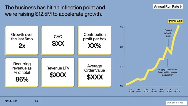
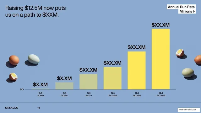
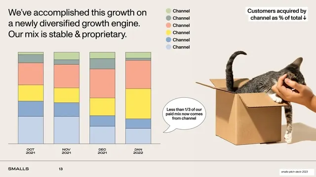
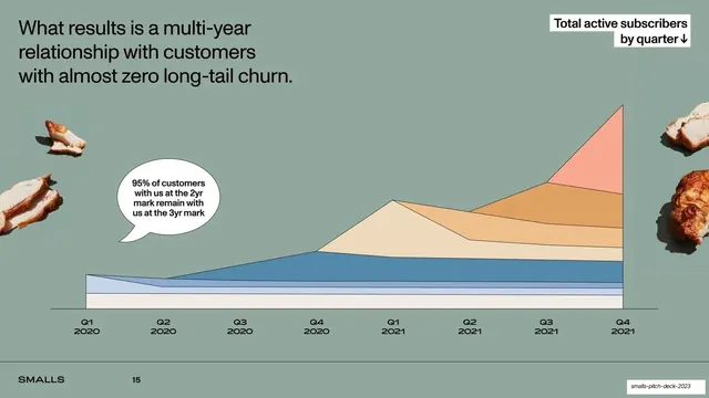
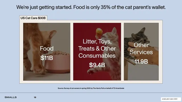
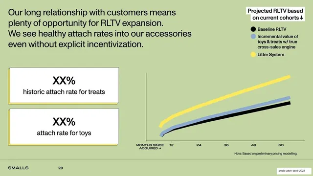
Slides run 16:9. Full-bleed lemon-yellow (about #FCE45B) divider slides carry one short centered black caption set in a wide-tracked uppercase grotesque ("WHY NOW", "PERFORMANCE", "FUTURE PLANS", "THANK YOU"). Content slides each take a different muted pastel ground: sage green, dusty terracotta, soft peach, periwinkle blue, and warm off-white. Headlines are a medium-weight sans, set large in mixed case at the top-left, often ending in a period. A consistent footer runs along a hairline rule at the bottom: the "SMALLS" wordmark at left and a page number beside it. Two recurring section-label devices appear top-right: a white box with a small downward arrow naming the chart ("Pet Food Market in $M", "Annual Run Rate", "Total active subscribers by quarter"), and a yellow highlighter swipe behind key words in headlines and callouts. Data visualization is disciplined to a single yellow line or bar against neutral comparison greys, with hand-drawn speech bubbles for annotations. White content cards float on a hard yellow offset drop-shadow. Photography is consistent studio work: ginger and tabby cats eating from blush bowls on bold seamless backgrounds, plus cut-out raw meat, eggs, and roast chicken scattered as garnish around the charts. Supporting layouts include a four-step illustrated "How it works" row with numbered line-art icons, a five-up team headshot row with prior-employer logos, a six-up metric KPI grid, a three-up press-quote row, and a three-image market-segment band with text overlaid.
Key takeaway
The single-accent discipline: one yellow does the dividers, the charts, the highlighter, and the card shadows, so a 24-slide deck feels unmistakably one brand without any other decoration. The yellow highlighter swipe over a single phrase is a cheap, repeatable way to direct the eye on a dense slide. And reducing every chart to one yellow series against grey makes the "look at this line" message unmissable. The scattered cut-out food props add warmth and personality to otherwise plain data slides.
Reuse notes
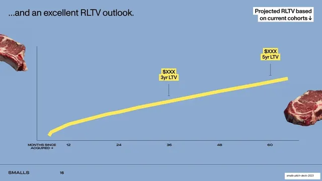
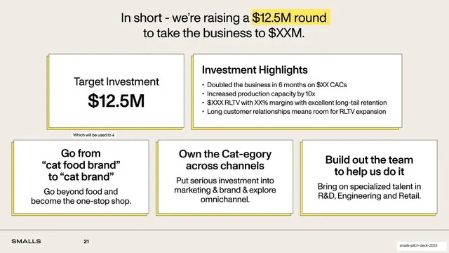
A strong reference for consumer-brand, DTC, or food investor decks, and for any pitch that wants to feel friendly and confident rather than corporate. The full-bleed colored divider into pastel content slides is a clean way to chapter a long narrative (problem, why now, performance, future plans). The single-accent-color system is directly transferable to any brand color. Needs genuinely good studio product and lifestyle photography to carry it; the cut-out food garnish only works against flat color grounds. The metric slides lean on placeholder values ($XX, $XXX) because the public version is redacted.