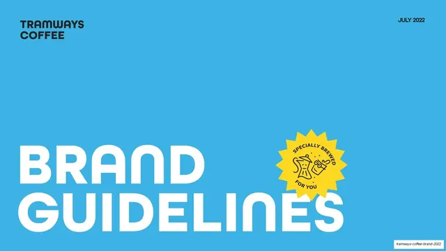
Preview image. Unlock full-res
A 31-slide coffee-brand guideline deck built on sky-blue and yellow section dividers, light-grey content pages, rounded geometric type, and whimsical black-line illustrations.
Summary
A 31-slide brand-guidelines deck for Tramways Coffee, an Indian craft-coffee brand. Its personality comes from a two-color system (sky-blue and bright yellow) carrying full-bleed section dividers, calm light-grey content pages, a rounded geometric grotesque type family, and a set of hand-drawn whimsical line illustrations that wrap around the wordmark.
Visual description
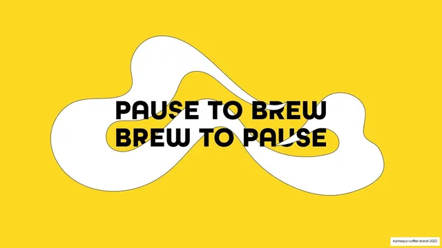
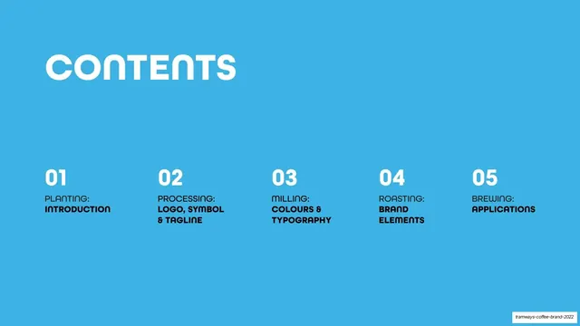
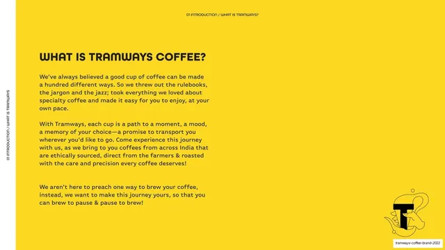
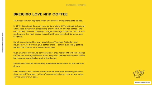
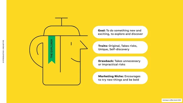
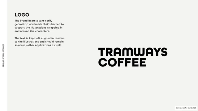
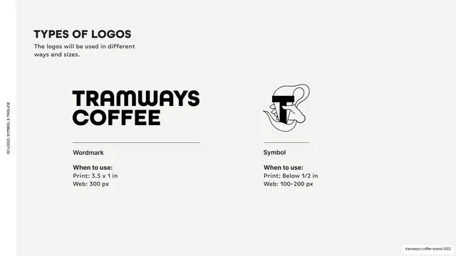
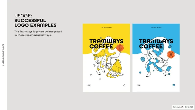
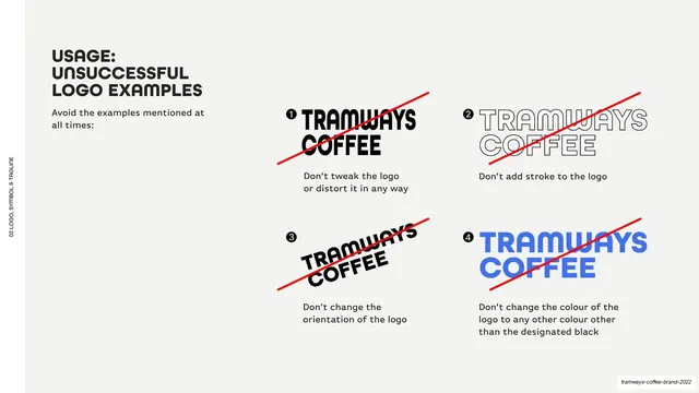
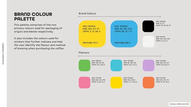
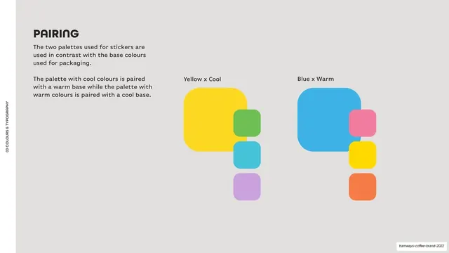
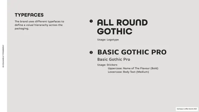
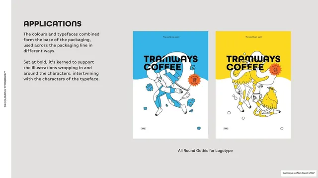
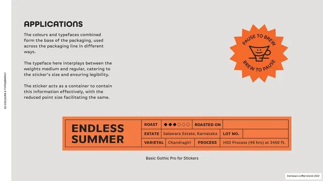
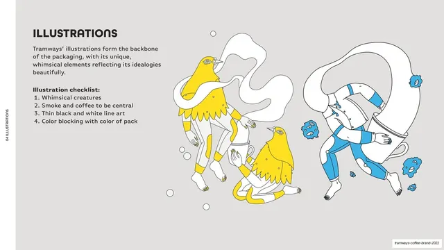
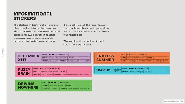
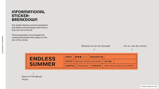
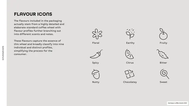
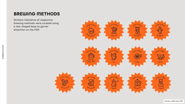
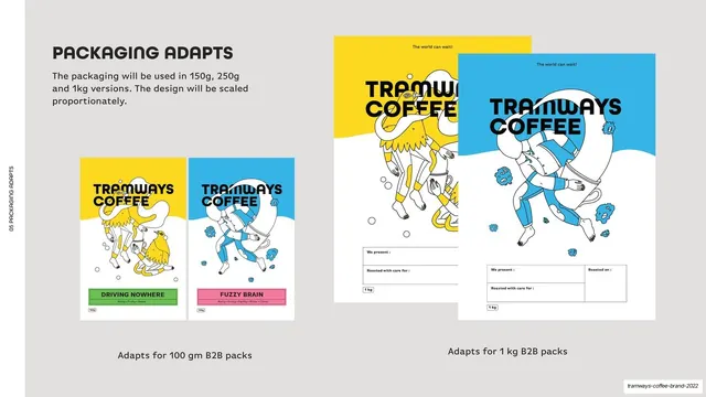
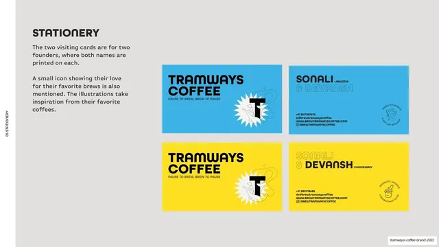
Slides run 16:9 and split into two modes. Section material (cover, the five numbered division openers, vision/mission, closing) is full-bleed in saturated sky-blue (#3CB4E5) or yellow (#FED925) with oversized type: a thin outline-weight headline ("PLANTING:", "MILLING:") stacked over a heavy bold word ("INTRODUCTION", "COLOURS & TYPOGRAPHY"), each section numbered 01-05 in white. Reference and specification material (logo rules, color palette, type, stickers, applications) sits on a neutral light-grey (#F5F4F2) ground with a left-aligned bold heading, a short two-paragraph intro at left, and the artifact shown large at right. A tiny vertical all-caps label runs up the left edge of every content slide (e.g. "02 LOGO, SYMBOL & TAGLINE"), and a small line-art teapot/symbol mark recurs bottom-right on intro pages. The type is rounded and geometric throughout: All Round Gothic for the TRAMWAYS COFFEE wordmark and display, Basic Gothic Pro for body. The illustration system is thin black-and-white line art of whimsical bird-and-figure creatures with smoke and coffee, color-blocked in the pack color, wrapping in and around the letterforms. Signature graphic devices: an orange (#F47C46) sunburst/star sticker carrying the "PAUSE TO BREW / BREW TO PAUSE" hook and the brewing-method icons; color-coded rectangular informational stickers laid out as a labeled table (blend name left; ROAST / ESTATE / VARIETAL / ROASTED ON / LOT NO. / PROCESS fields right) in green, pink, purple, cyan, yellow and orange; and a nine-icon flavour set (Floral, Earthy, Fruity, Spicy, Citrus, Bitter, Nutty, Chocolatey, Sweet). Mockups show poster-style 250g/1kg packs and two-color founder business cards.
Key takeaway
The disciplined two-color section system: every divider is one of two saturated brand colors at full bleed, so the deck stays loud and unmistakable while content pages drop to quiet grey. The struct-as-narrative trick of naming chapters after coffee production stages (Planting, Processing, Milling, Roasting, Brewing) instead of generic "Logo / Color / Type". And the color-coded sticker-as-table that does double duty as a spec label and a flavour-coding system, paired with a single repeatable sunburst stamp.
Reuse notes
A strong reference for playful consumer-brand or food-and-beverage guidelines, and for any identity system that leans on illustration plus a tight two-color palette. The numbered production-stage chapter structure is reusable for any process-driven brand story. The sunburst sticker and color-coded table label are directly liftable for packaging-heavy brands. Needs genuinely good custom line illustration to carry the personality; without it the grey reference pages read as plain. The blue/yellow combination is specific and high-energy, so retune the two colors to fit a different brand.
From this deck: Tramways Coffee Brand Guidelines 2022
View deck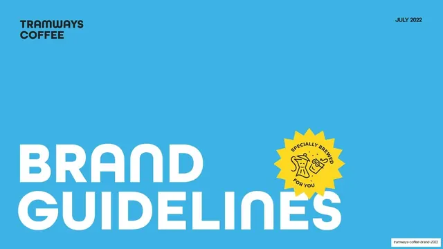


More like this


Keep what you find
A free account saves references to boards and can send you a weekly email of picks based on what you save.
To see every result, go Pro.