Preview image. Unlock full-res
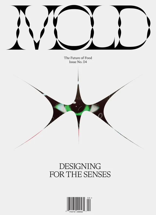
Editorial magazine cover for "The Future of Food Issue No. 04" featuring bold geometric type, abstract sensory imagery, and minimalist composition.
Summary
Swiss-style editorial design for a food-focused magazine issue with strong typographic hierarchy and abstract sensory visual elements suggesting color and texture.
Visual description
Light gray background with bold black display type spelling "MOOD" at top. Subtitle "The Future of Food Issue No. 04" in serif body text. Center features an abstract graphical shape—a black form with bright green and pink radiation lines suggesting sensory perception or chemical structure. Below, bold sans-serif text reads "DESIGNING FOR THE SENSES" in all capitals. Bottom includes barcode and small publisher mark. High contrast between minimal typography and expressive abstract forms.
Key takeaway
Pairing strict Swiss grid principles with expressive abstract elements creates sophisticated editorial layouts that feel both professional and imaginative.
Reuse notes
Suitable for editorial design, food publishing, or lifestyle magazines. The black-and-white base makes it easily adaptable. Abstract forms work particularly well for conceptual topics or sensory-focused content.
More like this

Keep what you find
A free account saves references to boards and can send you a weekly email of picks based on what you save.
To see every result, go Pro.