Preview image. Unlock full-res
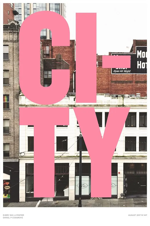
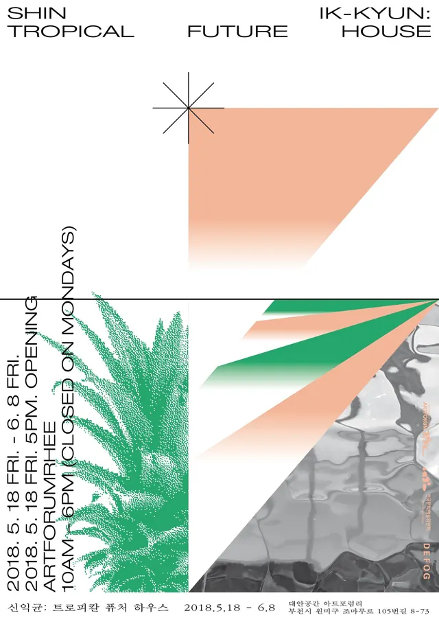
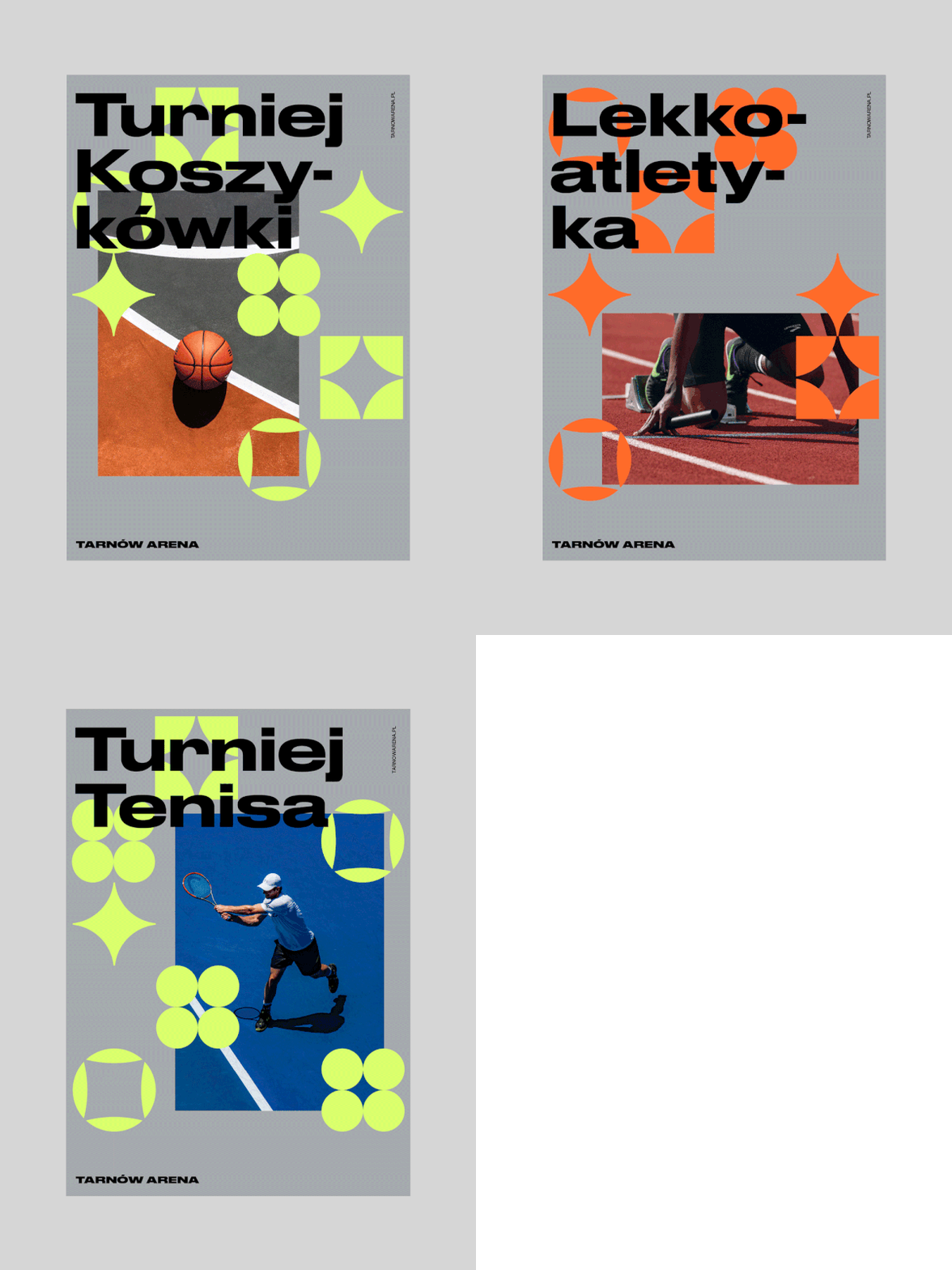
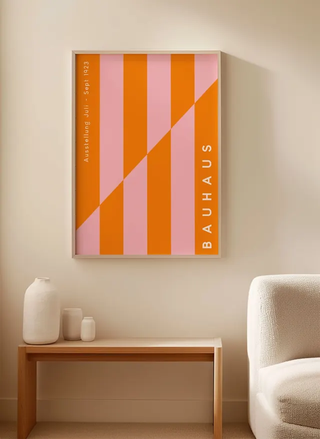
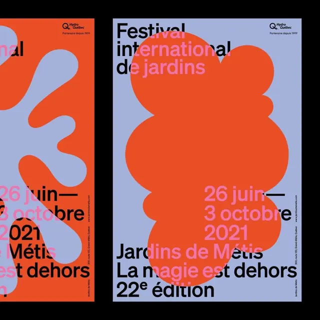
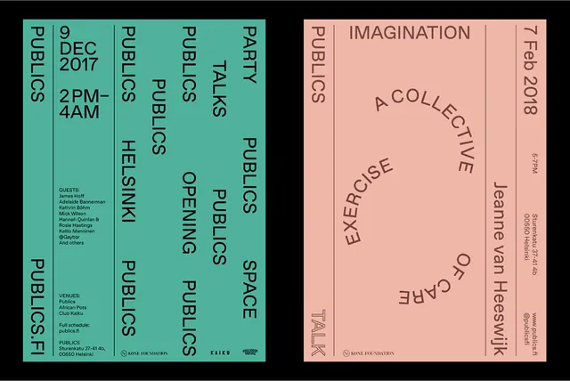
Two minimalist event posters use large vertical typography, thin divider lines, and sparse layouts on pastel backgrounds.
Summary
Two minimalist event posters use large vertical typography, thin divider lines, and sparse layouts on pastel backgrounds.
Visual description
The image shows two separate posters side by side on a black background. The left poster is teal with black vertical and stacked text, while the right poster is peach with brown text arranged around a large curved central phrase and narrow side columns.
Key takeaway
Use oversized vertical typography as the main graphic element, supported by thin rules and generous negative space. A two-tone palette can make a highly structured poster feel simple and contemporary.
Reuse notes
This approach works well for event posters, cultural programming, and identity systems where information needs to feel designed, not just listed. It is especially useful when you want strong poster impact with very little imagery.