Preview image. Unlock full-res
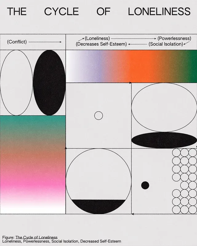
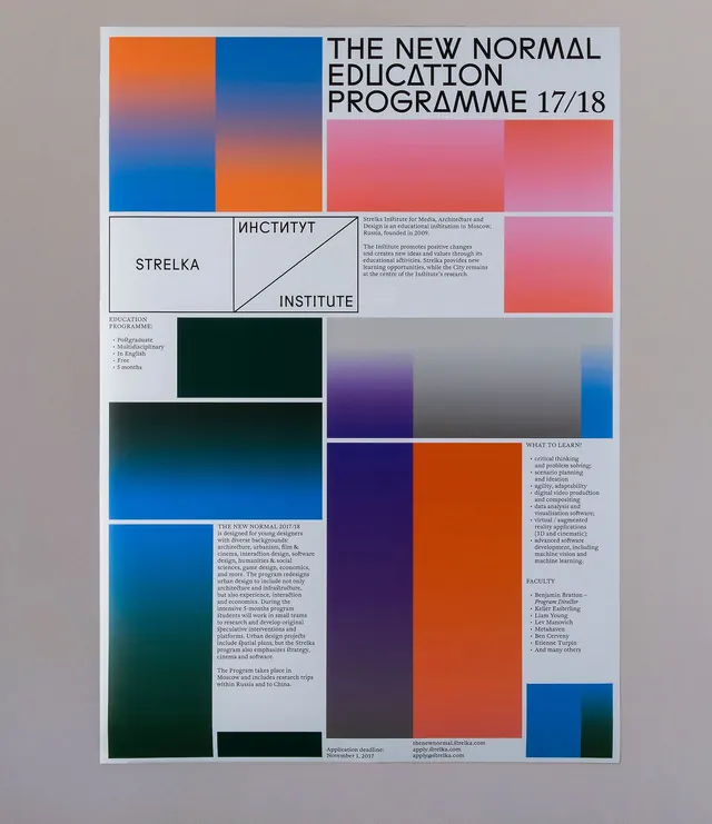
A print poster for a Strelka Institute education programme with a modular grid of large gradient blocks and black typography.
Summary
A print poster for a Strelka Institute education programme with a modular grid of large gradient blocks and black typography.
Visual description
The image shows a poster on a light background with a strict grid of framed rectangles filled with soft gradients in blue, orange, pink, purple, green, and gray. Large black headline text sits in the upper right, with smaller informational text blocks and labels distributed through the composition.
Key takeaway
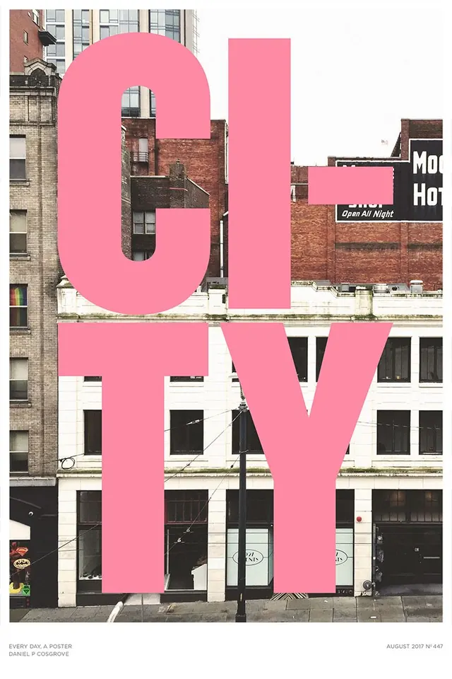
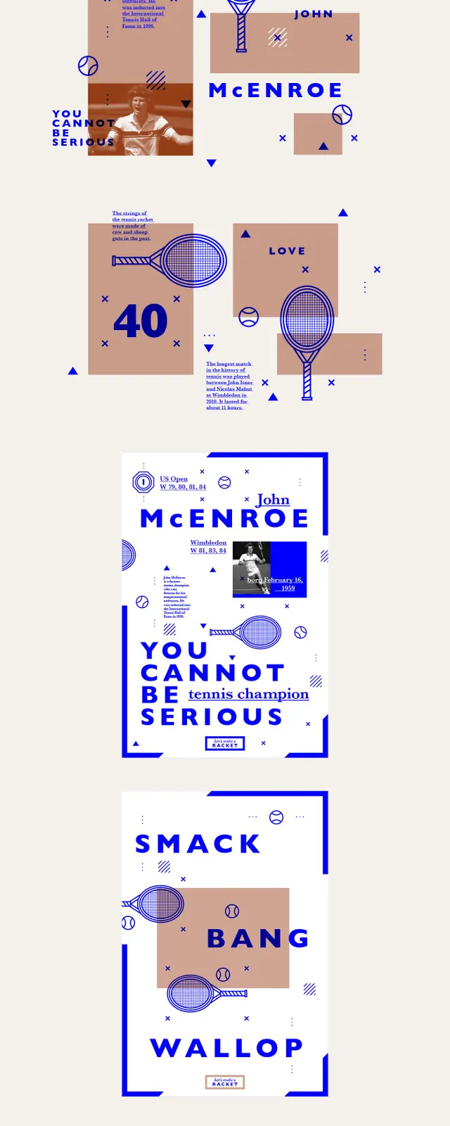
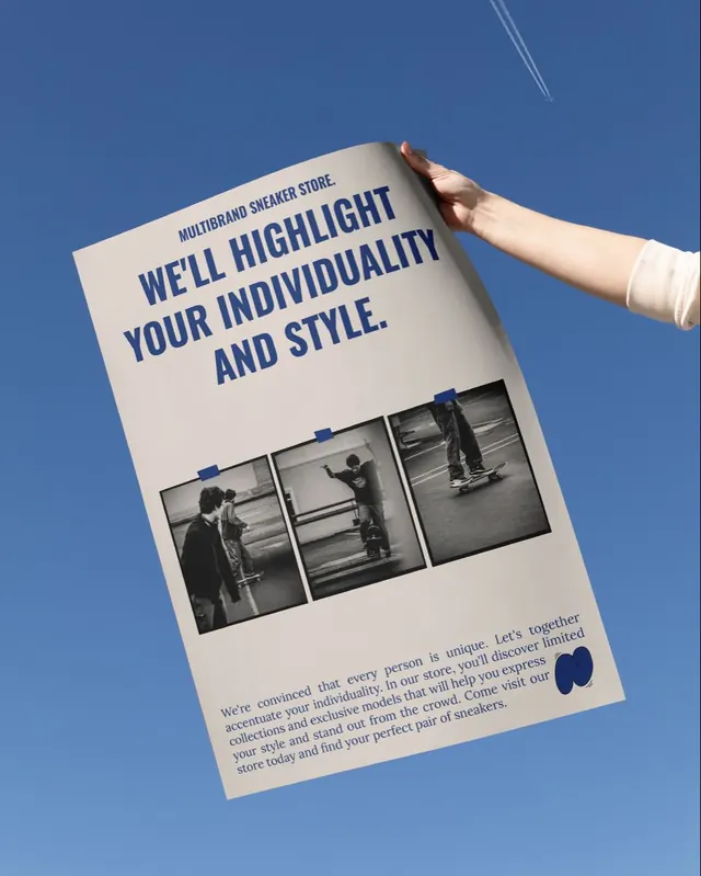
Use a rigid modular grid to organize a dense poster while letting the color blocks carry the visual energy. Combine oversized condensed headline typography with small serif body copy for a sharp editorial contrast.
Reuse notes
Reach for this when you need a print piece that feels institutional but visually modern. It works well for program announcements, cultural events, and identity systems that depend on structured variation rather than illustration.