Preview image. Unlock full-res
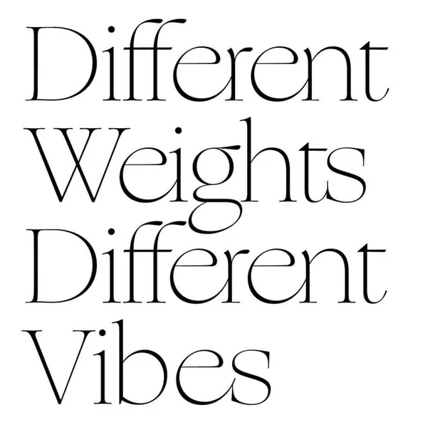
Clean typographic composition on white with the phrase "Different Weights Different Vibes" set in a refined serif with deliberately varied weights and spacing.
Summary
Clean typographic composition on white with the phrase "Different Weights Different Vibes" set in a refined serif with deliberately varied weights and spacing.
Visual description
White background. Three lines of elegant serif typography centered. "Different" in light weight, "Weights" in a noticeably heavier weight with slight overlap or tight spacing, "Different" again lighter, "Vibes" in a balanced medium weight. Generous whitespace above and below. The variation in stroke weight is the sole visual device.
Key takeaway
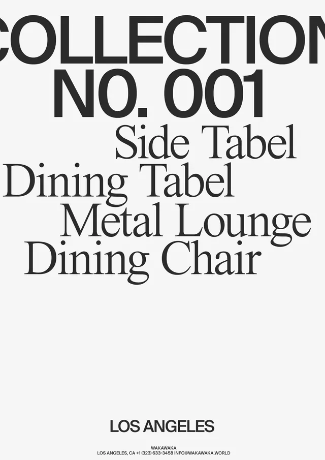
Using weight contrast within a single typeface family across stacked lines communicates the idea of variety and character without any additional imagery or color.
Reuse notes
Perfect for type foundry promos, design education, or editorial headers. The simplicity makes it versatile for posters, covers, or social graphics. Works on both light and dark grounds.