Preview image. Unlock full-res
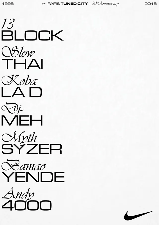
Minimal typographic poster celebrating a design event with mixed serif and sans-serif letterforms arranged in a vertical list on cream background.
Summary
A restrained Swiss-style event poster presenting artist names in mixed serif and sans-serif typefaces in a stacked vertical column, with minimal branding and event information tucked at the edges.
Visual description
Cream-colored background with black typography occupying only the left half of the composition. Six artist or performer names are listed vertically, each in a different typeface choice—some in script, some in geometric sans, some in traditional serif—creating a typographic study. A small Nike Swoosh sits in the lower right corner. Event details ("PLATTEN-TAUFE DOORS: 21:00", "@keskesess", "1988–2018") are positioned along the left and bottom margins in small sans-serif caps, adhering to strict grid alignment.
Key takeaway
Typographic variety within a constrained grid creates visual interest without illustration or color. The deliberate mixing of script and sans-serif letterforms becomes the entire design language.
Reuse notes
Strong template for arts events, festivals, or avant-garde product launches where typography itself is the hero. Works best with clean hierarchy and intentional whitespace. Not ideal for information-dense copy.
More like this
Keep what you find
A free account saves references to boards and can send you a weekly email of picks based on what you save.
To see every result, go Pro.