Preview image. Unlock full-res
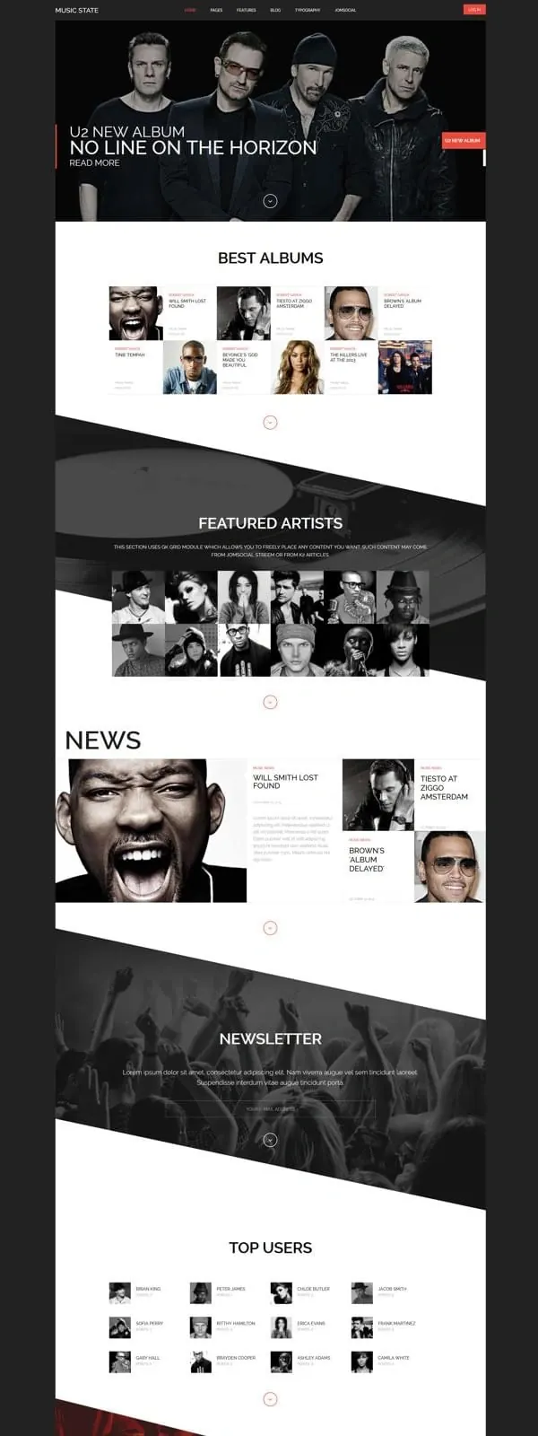
A music entertainment website for the U2 album 'No Line on the Horizon' using dynamic angled section dividers, grid-based content blocks, and bold typographic hierarchy.
Summary
A vertical music website layout promoting a U2 album using striking angled section dividers in white and dark tones, featuring hero band photo, curated content grids, and structured information architecture.
Visual description
Dark charcoal background with alternating angled white sections creating diagonal visual breaks. Top features a band photo with large oversized headline "U Up NEW ALBUM: NO LINE ON THE HORIZON" and red call-to-action button. Below, a "BEST ALBUMS" section with album covers and artist photos in a contained grid. Next, "FEATURED ARTISTS" shows a dense grid of black-and-white artist portraits. "NEWS" section displays featured stories with images and headlines. "NEWSLETTER" section with dark background image. "TOP USERS" shows a grid of user avatars and names. Footer contains categorized navigation (SOUND, ARTIST, NEWS, etc.). Consistent accent red color for buttons and interactive elements.
Key takeaway
The angled section dividers create visual momentum and break the monotony of vertical scrolling. Grid-based content organization with high contrast between dark and white sections provides clear hierarchy while maintaining editorial sophistication.
Reuse notes
Strong template for music, media, or entertainment websites requiring featured album/artist promotion. The geometric angled sections give energy to what could otherwise be a static list layout. Grid systems work well for showcasing multiple artists, albums, or community members simultaneously. Works best on dark backgrounds with strong accent colors.
More like this


Keep what you find
A free account saves references to boards and can send you a weekly email of picks based on what you save.
To see every result, go Pro.